gait analysis

All you ever wanted to know about the conventional gait model but were afraid to ask

cdcover

What seems an awfully long time ago now (2003!), Jill Rodda and I gave a tutorial on the Conventional Gait Model (Davis, Newington, Helen Hayes, Kadaba, VCM, PiG – whatever you want to call it) to the Gait and Clinical Movement Analysis Society in Wilmington, Delaware. For it I prepared a CD-ROM (cover picture above) with an interactive multi-media presentation on as many aspects of the model that I could think of. This includes:

  • Description of how the different segments are defined anatomically.
  • Guidelines on marker placement.
  • Practical guidance on coping with larger people, defining the coronal plane of the femur and deformed feet.
  • An analysis of the effects of misplacing various markers
  • Limitations of the model and suggestions for the future.

Some of it appears a little dated (the future is now for instance) but for anyone who is still using the CGM (and many people are) there is still a lot of material that will be useful.

The reason that I’m posting this is that I’ve now uploaded the files to our institutional repository where they can now be freely downloaded by anyone. Click here to access the files. Extract the files to a folder somewhere on your PC, go to the sub-folder PolygonViewer and double click on the folder PolygonViewer.exe. (Which reminds me that this is probably still one of the world’s longest Polygon reports!) Once you are in the presentation I think everything should be quite intuitive.

The video above shows two clips from the presentation illustrating the equivalence of Cardan angles and the joint angles as specified using the joint coordinate system (see this paper for a more comprehensive description).

Where’s the hip joint?

Most biomechanical models used in gait analysis require an estimate of where the hip joint is within the pelvis. The quest for the best equations to do this has become something of a Holy Grail within the gait analysis community. Andriacchi et al. (1980)  and Tylkowski (1982) were probably the first to propose methods for estimating its location and Bell, Brand and Peterson (1986) combined these in a method that they claimed predicted the joint centre to within 2.6cm with 95% certainty. At about the same time (1981) a different model was developed from x-ray studies at Newington Children’s Hospital which was incorporated into their clinical gait analysis software (finally published by Davis et al. in 1991).

ct-scans

Some time later Leardini et al. (1991) compared the Bell and Davis models against roentgen stereophotogrammetry and functional methods and found that the models differed quite significantly. Rather than choose one or the other he proposed a new set of equations. A little later Harrington et al. (2007) used MRI scans of a range of healthy children (14) and adults (8) and children with diplegic cerebral palsy (10) and generated another set of equations. A number of validation studies have suggested that those equations perform considerably better than the Davis equations  in healthy adults (Sangeux et al., 2011, Sangeux et al. 2014) and children with cerebral palsy (Peters et al., 2012). These have also suggested that Harrington’s equations generally work as well, or better, than modern functional methods.

One of the problems of the methods (highlighted by Sangeux last year) was that the equations scale the hip joint centre to measures of pelvic width (from one ASIS to the other) and depth (from the ASIS to the PSIS). Errors in measuring these, which can be particularly tricky in more obese subjects, can propagate to the hip joint centre estimates. It would be much better to scale to a measure that could be made more accurately such as clinical leg length.

Morgan (Sangeux) discovered that the Victorian Institute for Forensic Medicine had a repository of CT scans which we could access to investigate how well such scaling would work. He and PhD student Reiko Hara found scans of 37 children and 120 adults who had died without any signs of musculoskeletal injury or other abnormality and from which they were able determine the location of the hip joint centre relative to the anatomical landmarks on the pelvis as a function of leg length. As we published last week they found a set of linear functions of leg length that determine the hip joint location as well as the Harrington equations with a mean absolute error of 5.2mm or less in any single direction.

Interestingly (to me) the study showed that despite known differences in general pelvic morphology between males and females there were no appreciable differences in the location of the hip joint centres with respect to the anatomical landmarks (once scaled to leg length) and that age had only a small effect.

The method also means that we have an estimate of the size of the pelvis based on leg length that give us information that we can use when trying to locate where it is in relation to the ASIS and PSIS markers which could be particularly useful in people with higher BMI values.

Morgan has now made the data visible through a new data visualisation resource called Tableau. You can view it there using this link.

Electing a representative

One of the aspects of gait analysis that I didn’t cover in any particular depth in my book was how to select data from a number of trials that is in someway representative of the patient. I think one of the reasons for this is because I couldn’t easily get my hands on any data that illustrated the issues well. In some ways this speaks for itself – in my experience large inter-trial variability, larger enough to affect how we interpret data, is actually quite rare in clinical practice. If the variability is small then it doesn’t really matter what technique you choose.

representative-trial

My personal preference is to avoid the issue altogether by overplotting data from multiple trials on the same graphs (similar to the graphs on the left above but with data from the other side plotted in a different colour as well). In this way you can take into account both the general pattern and the variability when interpreting the data. Some people object that using this technique it can be difficult to appreciate subtle features in individual traces, but there is a real question as to whether you should be even looking at such features if they are not consistent from trace to trace.

Now I’ve started annotating graphs with symbols to identify specific features in the data, however, I find that the combination of symbols and multiple curves can be a bit too messy and have resorted to looking to a single trace that can be taken of as representative. Although alternatives have been proposed I use the average trace. It leads to a little smoothing of the data – which isn’t perfect – but none of the other techniques are perfect either. It was interesting last week to come across a patient’s data that illustrated beautifully the problems of doing this.

You can see the knee and hip traces here with the individual traces overlaid on the left and the averaged data plotted on the right. The problem is with the left knee. You can see that the patient exhibits two distinct patterns of knee movement in early stance (but remarkable repeatability elsewhere in the gait cycle). She either walks with full knee extension in early stance or with quite marked knee flexion. In the fully extended pattern her knee is more posterior and so there is increased hip extension as well (there is an effect on ankle dorsiflexion as well which I haven’t plotted). The average trace for the knee, however, falls well within normal limits and if you only ever looked at that trace you would never know that there was anything wrong with the knee.

None of the methods that are commonly used to generate a representative trace whether they be through picking one particular trace or providing some sort of averaging (mean or median) will result in something that represents the patient. The fundamental reason these don’t work is that this person’s gait is not characterised by one gait pattern, but by two, which she alternates between. It is not possible to understand her walking on a single curve, you need to look at multiple trials.

So although such issues don’t arise very often we don’t have a good way dealing with them in how we plot out or mark-up our data. What is needed is not a way of selecting single trace but a means of indicating that any single trace is unrepresentative. The broad semi-transparent bands on the right hand graphs are supposed to indicate that the trace cannot be appropriately interpreted without referring to the multiple trial data. I’ve now added them to the list of symbols that we use for marking up our graphs.

(PS The idea for a symbol to indicate underlying variability in the multiple trial data was first suggested to me by Sheila Gibbs in Dundee during an early consultation on the Impairment Focussed Interpretation methodology I outline in my book.)

(PPS if you do feel a need to select a representative trace and want to do this systematically then a robust method is presented by Morgan Sangeux in this recent paper. It is however worth noting that in the example he gives in Figure 1 the trace chosen as most representative overall does not give a good indication of the underlying data for either pelvic tilt or foot rotation despite the rigour of the technique.)

Gait analysis in the near future?

Last week we had a demonstration of new gait analysis software from Qualisys. It showed nearly automated capture of data from treadmill running and immediate export of data to a web-based report. It was really slick by comparison with other packages that I’ve seen, for which the developers require credit. Let’s hope it stimulates some competition amongst manufacturers to deliver truly user friendly systems. I still felt, however, that it is a long way from what should be possible given current technology.

It caused me to go back to a document a wrote for myself in 2009 trying to map out what  should happen in a clinical gait lab. It was my feeling that most of the technical elements described are currently available and all that is really required is for someone to stitch them all together. Here’s what I wrote:

The patient is welcomed at the door of the gait lab by a single gait analyst. The patient undresses to shorts and a t-shirt and the analyst attaches a number of markers quickly and easily to the patient. A small number of these have to be placed carefully but the others only need approximate locations.

The patient walks into the capture volume and stands still. The system detects they are standing still and captures the static trial. The patient performs the calibration exercises with or without assistance from the gait analyst (following a projection of what they are supposed to be doing on the wall of the laboratory). The system recognizes what they are doing and tells the gait analyst when sufficient calibration data has been captured.

Once this has happened the patient walks up and down several times.  Data capture is automatic and when sufficient data has been captured the system tells the gait analyst that this is the case. If data is required in another condition then the gait analyst tells the system this and the capture of walking data is repeated. The whole process takes about 15 minutes if one condition is required and another 10 minutes for any other conditions.

The quality of the data is continuously monitored. The system is only recalibrated when the system detects that this is required. Markers rarely fall off but if they do the system will tell the gait analyst who simply replaces them and the system automatically recalibrates for the slightly different marker position. Because there is redundancy in the system, it will continue to work even if one or two markers have fallen off. The system analyses the data and alerts the analyst immediately if there are any suspicious features (such as too much knee movement in the coronal plane).

All data is processed in real time and stored as required. The data is collated automatically into a report which is available immediately the tests are complete.

The system has been standardized so that essentially the same process takes place no matter where in the world the analysis is conducted and data from all sites is directly comparable.

I emphasize that all the elements to achieve this are already available. All we need is one (or all of the manufacturers) to cobble them together into a streamlined package. The system I saw last week was moving in the right direction but its still quite a long way from the final destination.

There’s a paragraph I’ve missed out that might be a bit more controversial and may take a little longer to develop:

… This report is based around a computer graphic animation of the subject walking with interpretation tools alerting the clinicians to specific features of the gait pattern and how these are linked to the patient’s underlying pathology. If the clinician wants then it will also make treatment suggestions. The entire report is written in a language that is comprehensible to a health professional with reasonable clinical experience but no specific training in 3-d gait analysis. There are no gait graphs in the report (although these are accessible should the clinician be old-fashioned enough to want to look at them).

Note I haven’t forgotten the physical exam – I’ve just assumed that this will have been conducted somewhere else beforehand, either immediately before at the same visit or on some previous occasion.

Can the ground reaction move for you? (competition with small prize)

Thought I’d do something different and run a little competition with the chance of winning a copy of  my book. It’s based on one of the learning exercises we give to our students on our Masters in Clinical Gait Analysis by distance learning  If you’ve got students, trainees or junior colleagues maybe you’d like to forward the URL of this post to them so that they can have a go. Our students enjoy the exercise and I assume they will too. They also learn a lot about how we walk and how to measure the ground reaction.

This exercise requires students to experiment with walking in different ways to modify the characteristics of the ground reaction. You can download  a full description here. First of all they are simply asked to walk at different speeds and record the ground reaction. They then compare the data with those in Mike Schwartz’s paper on how gait patterns in general vary with walking speed. Generally there is good agreement but occasionally we’ll find someone who doesn’t vary speed in the same way that the average person does (whoever that is!).

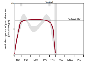
Then I give them a number of different graphs of theoretical ground reactions and ask them to try and walk in such a way that they match the shape of the graph. The two below, for example, are to walk with exaggerated peaks of the vertical component and then with a flat pattern.

GRF 1GRF 2

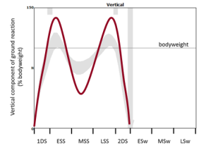
The students generally find these reasonably easy. The more alert ones spot that the flat pattern is simply what you get if you walk slowly but it can be reproduced in a normal speed walk if you think about what you are doing..

Then  come two more – one with the first peak higher than the second and finally the second peak higher than the first.

GRF 3GRF 4

Again the first is easy. It is what happens if you walk faster (but like the flat peaks there are also ways of recreating it at normal speed). The second is much harder and so far (over two years now) none of the students has come up with a convincing example of walking with a higher second peak than first.

This interests me because a few years ago Barry Meadows and some of his colleagues published a paper based on their observation that in patients with a wide range pathologies you almost always find that the second peak of the ground reaction is diminished – never the opposite. They called this Ben Lomonding, after a mountain in Scotland that has two peaks – one of which is higher than the other.

Ben Lomond

So I just wonder – is it possible to walk in this way? I’m prepared to offer a copy of my book (signed of course!) for the person who can provide the best version of the fourth graph above (2nd ground reaction considerably higher than the first) as real ground reaction data.

Part of the aim of the learning exercise is for students to think about the relationship between the ground reaction and the movement of the centre of mass and we ask them to explain how they have changed their walking pattern in order to alter the  ground reaction.

I suspect it will be a lot easier if you adopt a highly asymmetrical pattern or adjust your gait for the particular step when you hit the force plate. I’ll be more much more impressed if you can illustrate the phenomenon with a symmetrical, repeatable gait pattern.

I’ll use these last two criteria (convincing explanation, and repeatability and symmetry of gait) to judge the winner in the event that more than one person comes up with a solution.

Maybe we need a few rules. Two weeks feels like about the right time. Send entries to me (r.j.baker@salford.ac.uk) by midnight (UK time) on Monday 29th February. They should include:

  • a graph of the vertical component of the ground reaction (you might want to include the GRF from both legs if you want to impress me with your symmetry)
  • a video of you walking over the force plate (or you could send a link to one you’ve uploaded to YouTube of Vimeo or somewhere else publicly accessible – this is what I encourage our students to do). These are particularly useful if you can overlay the ground reaction vector but  I won’t insist on this as a lot of people still don’t have the technology (if all you’ve got is a smart phone then use that). Try and capture at least one step before and one step after the measurement if you want to impress me with the repeatability of your gait pattern).
  • a biomechanical explanation of how you have changed your walking pattern in order to change the ground reaction in this way.

To ensure that entries are genuine I will be try to replicate the best entries in my lab here on the basis of the explanations provided. If I can’t do this I may ask for proof that the data is real (e.g. data in a .c3d other file format that has obviously come directly from a force plate).

I’ll assume that in submitting these you’ll be happy for me to use the graphs and video  in a future post reporting the results. (Note that I won’t publish the explanations – I feel people should be free to write what they want without fear that it will get posted publicly).

Finally, if you enjoy the exercise and would like to engage more, why not think about enrolling on the Masters programme. You can do it as part time study in your current workplace and do not need to travel to Salford at all. You can find details at this link.