This post has been prompted by Mike’s comment on my last post. He pointed out two papers (Holt et al. 1991 and Minetti et al. 1995) that have investigated the relationship between stride frequency and oxygen rate (per time) when walking at constant speed on a treadmill. The papers come up with the two graphs which I’ve included below (Holt et al. on the left, Minetti et al. on the right).


In many ways I’m more interested in how the data is plotted than by what the results actually are.
Both show a u-shaped realtionship but that on the left gives the impression of a rather broad curve with a poorly defined minimum whereas that on the right tends to suggest a much deeper curve with a well defined minimum. The graphs look very different to me to the extent that I might even interpret the data differently. I might interpret the left hand graph as suggesting that you can vary your stride frequency between about 0.9 and say 1.1 Hz without making much difference to oxygen rate. The message I might take out of the right hand graph is that oxygen rate is highly dependent on frequency with a clear minimum at a little under PSF+5.
But then I realise that the axes are quite different. From the Holt paper we find that PSF is 57 strides per minute (0.94 Hz) so the range from PSF -15 to PSF+15 is from 0.7 and 1.2 Hz and we also find that the average weight was 70 kg so the range of VO2 (0.8-1.4 l/min) corresponds to about 11.5 – 20 ml/min/kg. We can use this information ot overplot the graph of Holt et al. onto that of Minetti et al.:
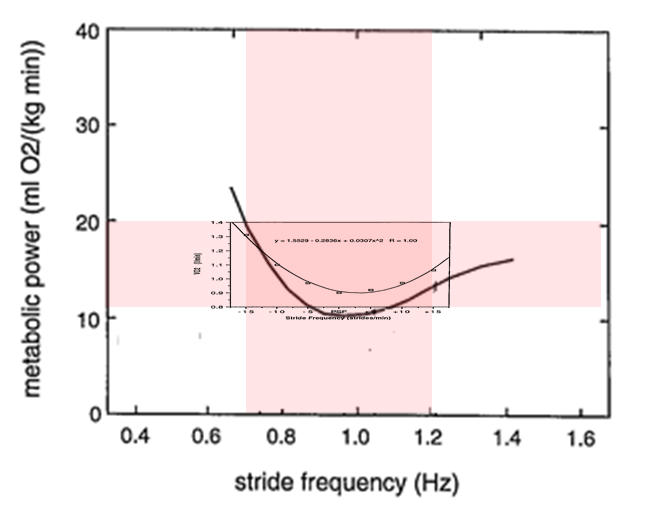
The data shows reasonable agreement given that the studies are not identical (and we have no way of knowing if the walking speeds were similar as this is not even recorded by Holt et al). What interests me is that conclusions are reversed. The data from Holt et al which appeared to show such a well defined minimum is even more broadly distributed than that from Minetti et al.
Conclusion one is that whilst there is a minimum in energy rate at about the preferred cadence this minimum is quite broad and with little change over quite a range of values either side of the minimum. Conclusion two is that choices in how you plot results can have quite a pronounced effect on how they are interpretted.
.
PS. For those of you who didn’t follow the comments yesterday this analysis is of oxygen rate with cadence at fixed speed is related to but different from the question of whether oxygen cost has a minimum value at self-selected walking speed which was the main focus of yesterday’s post.
.
Holt, K. G., Hamill, J., & Andres, R. O. (1991). Predicting the minimal energy costs of human walking. Med Sci Sports Exerc, 23(4), 491-498.
Minetti, A. E., Capelli, C., Zamparo, P., di Prampero, P. E., & Saibene, F. (1995). Effects of stride frequency on mechanical power and energy expenditure of walking. Med Sci Sports Exerc, 27(8), 1194-1202.
