gait graphs

Can the ground reaction move for you? (competition with small prize)

Thought I’d do something different and run a little competition with the chance of winning a copy of  my book. It’s based on one of the learning exercises we give to our students on our Masters in Clinical Gait Analysis by distance learning  If you’ve got students, trainees or junior colleagues maybe you’d like to forward the URL of this post to them so that they can have a go. Our students enjoy the exercise and I assume they will too. They also learn a lot about how we walk and how to measure the ground reaction.

This exercise requires students to experiment with walking in different ways to modify the characteristics of the ground reaction. You can download  a full description here. First of all they are simply asked to walk at different speeds and record the ground reaction. They then compare the data with those in Mike Schwartz’s paper on how gait patterns in general vary with walking speed. Generally there is good agreement but occasionally we’ll find someone who doesn’t vary speed in the same way that the average person does (whoever that is!).

Then I give them a number of different graphs of theoretical ground reactions and ask them to try and walk in such a way that they match the shape of the graph. The two below, for example, are to walk with exaggerated peaks of the vertical component and then with a flat pattern.

GRF 1GRF 2

The students generally find these reasonably easy. The more alert ones spot that the flat pattern is simply what you get if you walk slowly but it can be reproduced in a normal speed walk if you think about what you are doing..

Then  come two more – one with the first peak higher than the second and finally the second peak higher than the first.

GRF 3GRF 4

Again the first is easy. It is what happens if you walk faster (but like the flat peaks there are also ways of recreating it at normal speed). The second is much harder and so far (over two years now) none of the students has come up with a convincing example of walking with a higher second peak than first.

This interests me because a few years ago Barry Meadows and some of his colleagues published a paper based on their observation that in patients with a wide range pathologies you almost always find that the second peak of the ground reaction is diminished – never the opposite. They called this Ben Lomonding, after a mountain in Scotland that has two peaks – one of which is higher than the other.
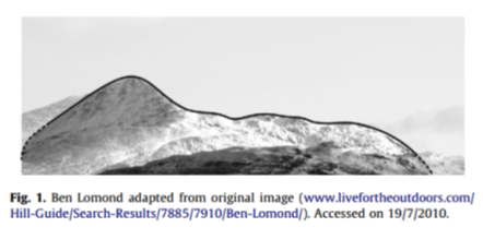
Ben Lomond

So I just wonder – is it possible to walk in this way? I’m prepared to offer a copy of my book (signed of course!) for the person who can provide the best version of the fourth graph above (2nd ground reaction considerably higher than the first) as real ground reaction data.

Part of the aim of the learning exercise is for students to think about the relationship between the ground reaction and the movement of the centre of mass and we ask them to explain how they have changed their walking pattern in order to alter the  ground reaction.

I suspect it will be a lot easier if you adopt a highly asymmetrical pattern or adjust your gait for the particular step when you hit the force plate. I’ll be more much more impressed if you can illustrate the phenomenon with a symmetrical, repeatable gait pattern.

I’ll use these last two criteria (convincing explanation, and repeatability and symmetry of gait) to judge the winner in the event that more than one person comes up with a solution.

Maybe we need a few rules. Two weeks feels like about the right time. Send entries to me (r.j.baker@salford.ac.uk) by midnight (UK time) on Monday 29th February. They should include:

  • a graph of the vertical component of the ground reaction (you might want to include the GRF from both legs if you want to impress me with your symmetry)
  • a video of you walking over the force plate (or you could send a link to one you’ve uploaded to YouTube of Vimeo or somewhere else publicly accessible – this is what I encourage our students to do). These are particularly useful if you can overlay the ground reaction vector but  I won’t insist on this as a lot of people still don’t have the technology (if all you’ve got is a smart phone then use that). Try and capture at least one step before and one step after the measurement if you want to impress me with the repeatability of your gait pattern).
  • a biomechanical explanation of how you have changed your walking pattern in order to change the ground reaction in this way.

To ensure that entries are genuine I will be try to replicate the best entries in my lab here on the basis of the explanations provided. If I can’t do this I may ask for proof that the data is real (e.g. data in a .c3d other file format that has obviously come directly from a force plate).

I’ll assume that in submitting these you’ll be happy for me to use the graphs and video  in a future post reporting the results. (Note that I won’t publish the explanations – I feel people should be free to write what they want without fear that it will get posted publicly).

Finally, if you enjoy the exercise and would like to engage more, why not think about enrolling on the Masters programme. You can do it as part time study in your current workplace and do not need to travel to Salford at all. You can find details at this link.
 

Choosing your moment

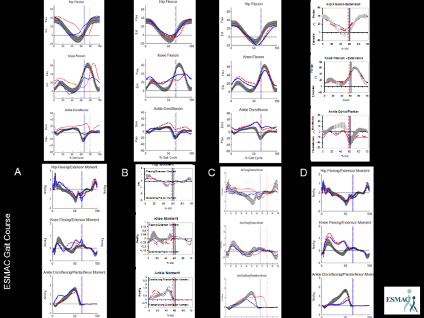
Hi, sorry its been so long since I posted but I’ve been reinvigorated by this year’s ESMAC conference here in Heidelberg. Earlier in the week I had the pivilege of sitting in on a session of the ESMAC gait course. Julie Stebbins had arranged a short quiz to start people thinking on Wednesday morning and the last question caught my attention. It’squite simple. There are four sets of kinematics along the top and four of kinetics along the bottom labelled A to D. What order do the kinetic datasets need to be arranged in to match the kinematic graphs (and why)? (You should be able to get a bigger view by double clicking on the picture.

choosing your moment

Gait graphs for beginners

I’m teaching about gait to the undergraduate physios next week. Its the first lecture I’ve given at this level trying to emphasise the approach I’ve developed in the Why we walk the way we do videos. The colleague who’s delivering the previous lecture – which included a first introduction to gait graphs – wanted to use the same format as I use which started a conversation about what aspects of walking we’d like those graphs to emphasize.

Knee graph

I’m pretty keen on fixed aspect ratios and scaling so that you can forget about those issues when you are actually looking at data – so we’ve fixed that.  We wanted also wanted to reinforce the terminology for different phases that I’ve described in a previous post – so we’ve put those abbreviated names across the top.

I also like to represent the continuity of the gait cycle – it amazes me how many people I come across who don’t seem to realise that point on the far left of the graph is the same as the point on the far right hand side (give or take a little stride to stride variability). It’s also not uncommon to spot data in the literature where values of gait variables at 0% and 100% are different but not commented upon. Various people in the past have tried plotting more than a single stride to try and emphasize continuity. I know Jurg Baumann was an advocate of this but can’t find easily get my hands on a sample. At Hof also used it – his 2002 paper on the speed dependence of EMG profiles is an example – but it has never really caught on. In this format I’ve tried to capture the point by allowing the gait curves to fade away to nothing outside the graph. It’s a bit messy if you’ve got a whole array of graphs but I kind of like it in the context of an introduction at this level.

I’m also very keen on getting students to appreciate what the right leg is doing plotted on the same time scale as the left leg. I know this insenses people who are paranoid about the importance of symmetry in gait but it’s a hell of a lot easier to explain the biomechanics if you look at the data this way. It’s unconventional of course so I’ve chosen to represent this as a much fainter line.

There was another question mark over the hip angle. As gait analysts most of us assume that this should be measured relative to a pelvic axis represented by the line from PSIS to ASIS and thus biasing the hip graph towards flexion. In assessing gait by observation, however, physios almost always consider the angle with the vertical which might be more relevant for daily practice. In the end we decided to stick with the gait analysis approach and just make sure we explain this very clearly.

Anyone got any additional features they like to add?

.

Hof, A. L., Elzinga, H., Grimmius, W., & Halbertsma, J. P. (2002). Speed dependence of averaged EMG profiles in walking. Gait Posture, 16(1), 78-86.

Making attractive gait graphs in Polygon

Not a proper post this one and only of interest to Vicon users but, prompted by one of the students on our Masters Programme in Clinical Gait Analysis,  I’ve created a video to illustrate how to create nice gait graphs within Polygon. It also shows how you can export these easily to Word and the data to Excel (then you can look at an earlier post to see how to create yet another set of graphs!) .  I’ve used Polygon 4 to create the video but I know there are still many Polygon 3 users out there. The interface looks a little different but the basic process is exactly the same. The main difference is that there is no Attributes panel in Polygon 3. In most cases you have to right click on an object (graph, graph axis etc) and select one of the options on the menu that then appears.


Who first thought of a gait graph?

Quite out of the blue Jenny Kent from Headley Court asks if I know where the gait graphs we know today come from. She was particularly interested in where the idea of time normalising data to the gait cycle originated. I have to admit I just don’t know.

Braune and Fischer, working at the end of the 19th century, certainly plotted a number of gait variables against time, most for swing but a few for more than a gait cycle. All the graphs I can see though plot these against time rather than a percentage of the gait cycle and the data for more than a gait cycle doesn’t appear to be plotted in relation to the gait events at all.

The first group that I can find that present variables on graphs with the time axis labelled as % gait cycle is Inman’s group working in Berkeley in the early 1950s.

Inman time normalisation

Data scanned a long time ago from one of the outputs of the Berkeley group – not sure which.

Can anyone provide any earlier examples?

.

This made me think about other features of our standard gait graphs. Who first proposed plotting data from a patient against normative reference data depicted as a mean and range based on the standard deviation?

I remember that when the Vicon Clinical Manager software came out in 1992 that it assumed that all data was normalised to the gait cycle (the data was actually stored in a .gcd file on this assumption). The software only allowed three traces to be plotted on any graph so the common practice was to plot the mean of the reference data along as one right and one left side trace for each patient. I think the practice of plotting several (three!) traces from each side separately to assess measurement variability probably dated to this time as well. I don’t remember the standard deviations being plotted but this may just be my memory (the standard deviation values could certainly be stored in the .gcd file).

I also remember being impressed by teaching material from Newington and Gillette Hospitals (Gage, Davis and Ounpuu) which plotted the standard deviation ranges from quite an early stage. Looking up some of their early papers I find that  Sylvia’s 1995 paper contains sample patient data plotted against the standard deviation ranges. (Unfortunately the quality of this figure in the .pdf file I have is too poor to be worth reproducing here).

Sylvia moved to Newington from Waterloo so I wondered how David Winter had plotted his data. Sure enough in the final chapter of The Biomechanics and Motor Control of Human Walking (1991) entitled “Assessment of pathological gait” are a series of graphs showing gait variables from a patient with a knee replacement plotted against the mean and standard deviation from a reference population. (This book was an adaptation of an earlier one form 1987 which I don’t have access to and I’d be interested to know if these graphs were included in that as well).

 winter gait graphs

I’d like to suggest that this might be the earliest example of gait graph as we use them today – or has anyone got any earlier examples?

Of course tracing ideas back like this is a slightly ridiculous activity because such graphs  often appear in publications only after having been used more generally for a considerable period. Just because they first appear in print from one team does not necessarily mean that they originated there!

.

Braune, W., & Fischer, O. (1987). The Human Gait (P. Maquet & R. Furlong, Trans.). Berlin ; New York: Springer-Verlag.

Klopsteg, P. E., & Wilson, P. D. (1954). Human Limbs and their Substitutes. New York: McGraw-Hill.

Ounpuu, O., Davis, R., & Deluca, P. (1996). Joint kinetics: Methods, interpretation and treatment decision-making in children with cerebral palsy and myelomeningocele. Gait and Posture, 4, 62-78.

Winter, D. (1991). The biomechanics and motor control of human gait: Normal, Elderly and Pathological (2nd ed.). Waterloo:: Waterloo Biomechanics.