joint kinematics

All you ever wanted to know about the conventional gait model but were afraid to ask

cdcover

What seems an awfully long time ago now (2003!), Jill Rodda and I gave a tutorial on the Conventional Gait Model (Davis, Newington, Helen Hayes, Kadaba, VCM, PiG – whatever you want to call it) to the Gait and Clinical Movement Analysis Society in Wilmington, Delaware. For it I prepared a CD-ROM (cover picture above) with an interactive multi-media presentation on as many aspects of the model that I could think of. This includes:

  • Description of how the different segments are defined anatomically.
  • Guidelines on marker placement.
  • Practical guidance on coping with larger people, defining the coronal plane of the femur and deformed feet.
  • An analysis of the effects of misplacing various markers
  • Limitations of the model and suggestions for the future.

Some of it appears a little dated (the future is now for instance) but for anyone who is still using the CGM (and many people are) there is still a lot of material that will be useful.

The reason that I’m posting this is that I’ve now uploaded the files to our institutional repository where they can now be freely downloaded by anyone. Click here to access the files. Extract the files to a folder somewhere on your PC, go to the sub-folder PolygonViewer and double click on the folder PolygonViewer.exe. (Which reminds me that this is probably still one of the world’s longest Polygon reports!) Once you are in the presentation I think everything should be quite intuitive.

The video above shows two clips from the presentation illustrating the equivalence of Cardan angles and the joint angles as specified using the joint coordinate system (see this paper for a more comprehensive description).

Coping with maternity leave

How do you ensure that staff going on maternity or paternity leave do not get deskilled during their period away from gait analysis?

Here’s an idea to provide a regular knowledge update. The Verne mobile consists of  6 fully articulated Verne‘s allowing the user to set them in any desired pose. They are arranged in a circle to reinforce the importance of cyclic movement patterns. Comes complete with a customised worksheet* of cyclic gait patterns for the user to re-create. Choose three from the following list to suit any laboratory or clinic:

Made in attractive colours to blend in with the decor of any nursery.

Congratulations Julie on the birth of William

* it doesn’t really – this bit’s a joke – but I was fascinated at the wide variety of gait patterns that we now have some form of kinematic data for (the mobile is real though!).

Electing a representative

One of the aspects of gait analysis that I didn’t cover in any particular depth in my book was how to select data from a number of trials that is in someway representative of the patient. I think one of the reasons for this is because I couldn’t easily get my hands on any data that illustrated the issues well. In some ways this speaks for itself – in my experience large inter-trial variability, larger enough to affect how we interpret data, is actually quite rare in clinical practice. If the variability is small then it doesn’t really matter what technique you choose.

representative-trial

My personal preference is to avoid the issue altogether by overplotting data from multiple trials on the same graphs (similar to the graphs on the left above but with data from the other side plotted in a different colour as well). In this way you can take into account both the general pattern and the variability when interpreting the data. Some people object that using this technique it can be difficult to appreciate subtle features in individual traces, but there is a real question as to whether you should be even looking at such features if they are not consistent from trace to trace.

Now I’ve started annotating graphs with symbols to identify specific features in the data, however, I find that the combination of symbols and multiple curves can be a bit too messy and have resorted to looking to a single trace that can be taken of as representative. Although alternatives have been proposed I use the average trace. It leads to a little smoothing of the data – which isn’t perfect – but none of the other techniques are perfect either. It was interesting last week to come across a patient’s data that illustrated beautifully the problems of doing this.

You can see the knee and hip traces here with the individual traces overlaid on the left and the averaged data plotted on the right. The problem is with the left knee. You can see that the patient exhibits two distinct patterns of knee movement in early stance (but remarkable repeatability elsewhere in the gait cycle). She either walks with full knee extension in early stance or with quite marked knee flexion. In the fully extended pattern her knee is more posterior and so there is increased hip extension as well (there is an effect on ankle dorsiflexion as well which I haven’t plotted). The average trace for the knee, however, falls well within normal limits and if you only ever looked at that trace you would never know that there was anything wrong with the knee.

None of the methods that are commonly used to generate a representative trace whether they be through picking one particular trace or providing some sort of averaging (mean or median) will result in something that represents the patient. The fundamental reason these don’t work is that this person’s gait is not characterised by one gait pattern, but by two, which she alternates between. It is not possible to understand her walking on a single curve, you need to look at multiple trials.

So although such issues don’t arise very often we don’t have a good way dealing with them in how we plot out or mark-up our data. What is needed is not a way of selecting single trace but a means of indicating that any single trace is unrepresentative. The broad semi-transparent bands on the right hand graphs are supposed to indicate that the trace cannot be appropriately interpreted without referring to the multiple trial data. I’ve now added them to the list of symbols that we use for marking up our graphs.

(PS The idea for a symbol to indicate underlying variability in the multiple trial data was first suggested to me by Sheila Gibbs in Dundee during an early consultation on the Impairment Focussed Interpretation methodology I outline in my book.)

(PPS if you do feel a need to select a representative trace and want to do this systematically then a robust method is presented by Morgan Sangeux in this recent paper. It is however worth noting that in the example he gives in Figure 1 the trace chosen as most representative overall does not give a good indication of the underlying data for either pelvic tilt or foot rotation despite the rigour of the technique.)

Clearing the air

Every so often I’m asked about why we tend to do clinical gait analysis barefoot and in AFOs (and shoes). One answer is that the barefoot condition tends to give a better indication of the full extent of a patient’s problems whereas walking in AFOs may be a better indication of how they function in everyday life. Another, however, is that sometimes walking in AFOs can help in identifying which particular impairments are having the most effect on gait. This was certainly the case when, a couple of weeks ago, I was reviewing one of the case studies we often use for teaching purposes but which exhibited features that I had not previously understood.

The analysis is of a seven year old girl with diplegic cerebral palsy (GMFCS III). She can take a few steps unaided but normally walks with a K-walker. We actually tested her in and out of the K-walker barefoot and in shoes and AFOs. the K-walker didn’t make that much difference to the kinematics with either condition so we’ll focus on the two unassisted walking conditions.

toe-walking-graphs

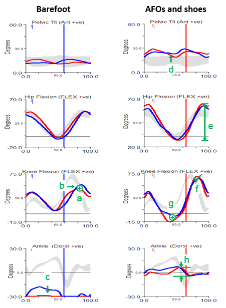
Perhaps the most obvious feature of the barefoot data is that she walks right up on her toes in considerable plantarflexion (feature c). The physical examination data shows that plantarflexor contractures (no passive dorsiflexion with knees extended beyond 10° plantarflexion ) can account for some of this but there are also signs of spasticity (from modified Tardieu and Ashworth tests). There is also, however, some suggestion of late (feature b) and reduced (feature a) knee flexion in swing. There is no clear explanation of this from the physical exam although there is a response to the Duncan-Ely test when performed quickly which might indicate some rectus femoris spasticity. Along with these specific findings the assessment indicates generalised weakness, persistent bilateral femoral neck anteversion and some mild tightness of the hip flexors.

The gait analysis with AFOs is quite different. The solid AFOs cast in a neutral position (which might have been assumed to be too aggressive given the physical examination) do appear to be holding the ankle in neutral  and substantially limit movement at the ankle (feature h).  The pelvis is a little more anteriorly tilted (feature d), possibly to move the centre of mass anteriorly as the new sagittal plane foot alignment will move the centre of pressure anteriorly (the steps were too short to get reliable kinetics). This would also exert a greater external extending moment at the knee which accounts for the hyperextension in late stance (feature g). The increased pelvic tilt leads to increased maximum hip flexion whereas the hyperextension pushes the knee back and maintains maximum peak hip extension. The overall effect is an increased range of movement at the hip (feature e). Perhaps most interestingly though, given that there is a question as to whether the rectus is spastic or not, is that peak knee flexion in swing is essentially normal (feature f). The slope of the knee graph through toe off is if anything a little steeper than normal. Such free flexion of the knee suggests that rectus spasticity is not a problem. Peak knee flexion is still delayed but this is clearly seen to be a consequence of the knee being too extended as it starts to flex in middle single support rather than of any stiffness. In summary, the data from the barefoot condition is inconclusive as to whether rectus femoris spasticity is contributing to the gait pattern but the data from the AFO condition provides quite strong evidence that it is not.

I hope that this has answered the question I posed at the beginning of this post but it does prompt another question – if there is no rectus spasticity then why is peak knee flexion so reduced in the barefoot condition?

I think the answer to this may lie in the observation that if a person is walking on their toes (and in plantarflexion) then it actually requires considerably less knee flexion for clearance in swing than in normal walking. In other words this girl may be showing reduced knee flexion in swing simply because she doesn’t need it when walking barefoot not because there is anything wrong with her knee function.In AFOs the ankle is held in neutral which makes clearance much more difficult and she has no option but to flex the knee more. It is interesting to note that when walking with shoes and AFOs she walks 20% slower than in bare feet and looks considerably less stable and fluent in her movements.

Rather than waste a lot of text in trying to explain why this occurs I’ve recorded a short video using Verne to illustrate that this is the case.

I go into the underlying concepts in relation to normal gait in this screen cast and have explored some of the other consequences of this for those walking in a more crouched gait pattern in this video blog.

Choosing your moment

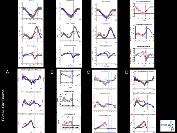
Hi, sorry its been so long since I posted but I’ve been reinvigorated by this year’s ESMAC conference here in Heidelberg. Earlier in the week I had the pivilege of sitting in on a session of the ESMAC gait course. Julie Stebbins had arranged a short quiz to start people thinking on Wednesday morning and the last question caught my attention. It’squite simple. There are four sets of kinematics along the top and four of kinetics along the bottom labelled A to D. What order do the kinetic datasets need to be arranged in to match the kinematic graphs (and why)? (You should be able to get a bigger view by double clicking on the picture.

choosing your moment