normalisation

Normalising kinetics

There were a few things that struck me as odd when I was writing my book. Things that we’ve always done in a particular way in clinical gait analysis but which just don’t make sense. One of these is the way we typically “normalise” kinetic data by dividing through by mass only. Moments are a product of force and length and are thus likely to be influenced both by a person’s weight and their size. It just doesn’t make sense to normalise data by dividing through by weight only. There are similar, but slightly more complex, issues with joint power. Differences in adult height between individuals, expressed as a percentage, tend to be reasonably small (SD < 10%) even disregarding gender, so the effects of not normalising to height in adults are unlikely to be that important. Clinical gait analysis, however, has always had a considerable focus on children where differences in height are much larger. It just seems so obvious that we should normalise to height as well as weight. In my book I see that I actually commented, “Quite why this is not standard practice in gait analysis is unclear.”

A simple explanation may be that no-one has ever tested this assumption. So one of my colleagues (Ornella Pinzone) has performed a comparison of conventional normalisation (dividing moments and powers by mass only) and non-dimensional normalisation (dividing moments by mass and leg length and powers using a slightly more complex formula). We based it on data made available by Mike Schwartz from Gillette as their data are so well formatted for a study like this. The paper has just been published in Gait and Posture and if you use this link before 29th January then you should be able to view and download a copy of the article for free.

Pinzone

Coefficients of determination for relationship between a range of temporal, spatial and kinetic parameters and age amongst children across an age range from 4 to 18 years. Dashed line shows threshold for statistical significance at p<0.05.

The results are quite conclusive. About 80% of the associations between the conventionally normalised parameters and age, height and weight, were statistically significant (p<0.05) and for all of those parameters where the association was significant it was substantially reduced by non-dimensional normalisation (only just over 20% were statistically significant and most only marginally exceeded the p<0.05 threshold). The results have dispelled any lingering doubts in my mind as to the superiority of non-dimensional normalisation and when we next revise our normative dataset we’ll be using this as standard.

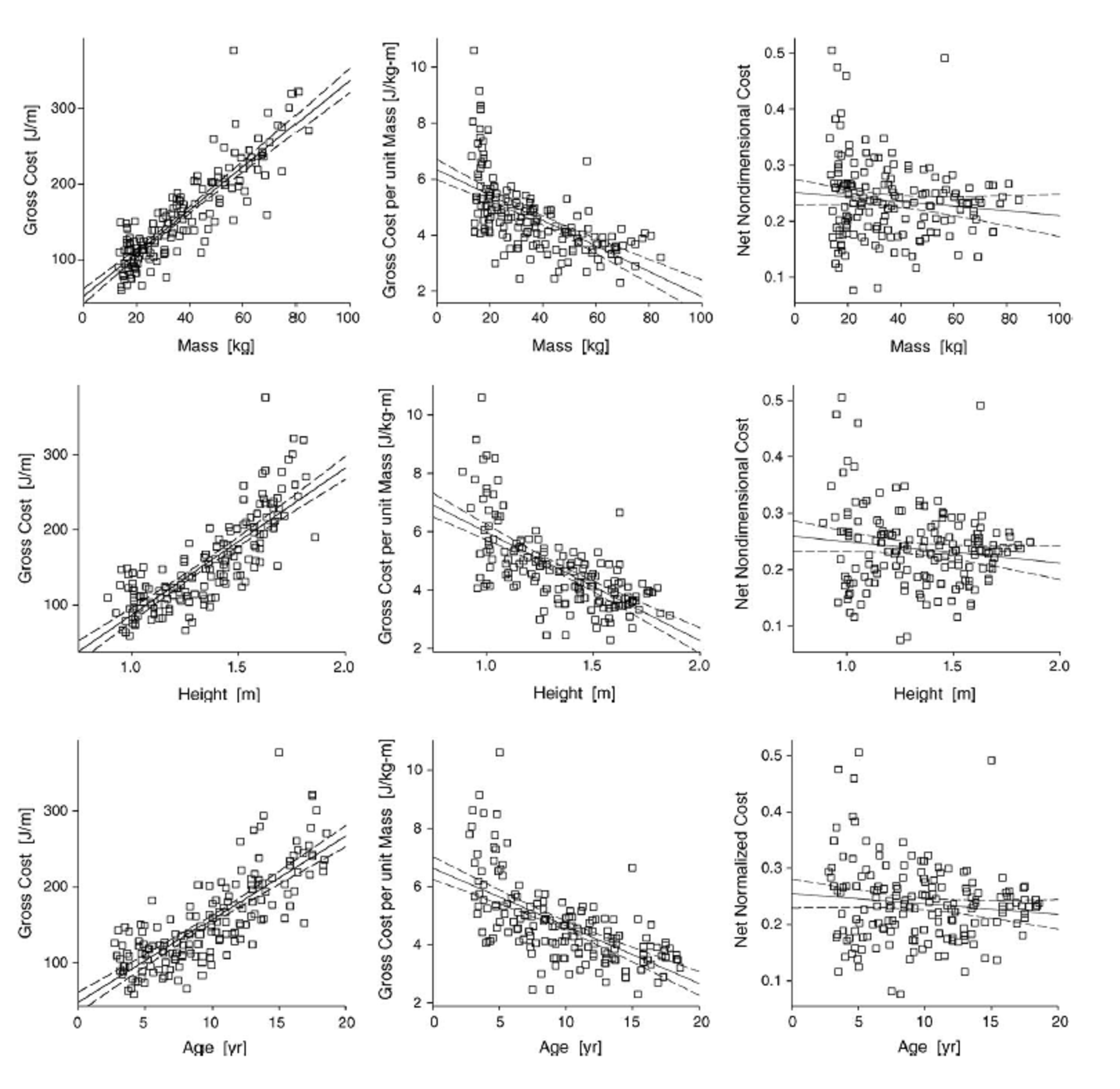
This isn’t quite the whole story, however, because even when you remove the systematic effects of height and weight (this is the primary purpose of normalisation) there is still a lot of scatter in the data. The figure below shows the relationship of peak knee extensor moment with leg length for conventional (top) and non-dimensional (bottom) normalisation. The slope on the line of regression is reduced to almost zero with non-dimensional normalisation but there is minimal effect on the scatter of data points about this line.

Pinzone2

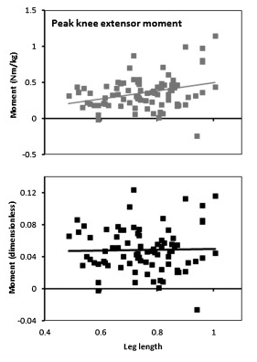
Peak knee extensor moment plotted against leg length for conventional (top) and non-dimensional (bottom) normalisation.

It is difficult to compare this variability with that present in kinematic data because the nature of the data is so different but the impression I get is that the variability in the kinetic data is even greater than that in the kinematic data. I’ve commented in two earlier posts (here and here) that I think the assumption that we all walk similarly, an assumption on which all clinical gait analysis is based, needs to be re-examined. The most obvious conclusion from this dataset is that many of us, even in the absence of pathology, walk very differently.

Advertisement

Who first thought of a gait graph?

Quite out of the blue Jenny Kent from Headley Court asks if I know where the gait graphs we know today come from. She was particularly interested in where the idea of time normalising data to the gait cycle originated. I have to admit I just don’t know.

Braune and Fischer, working at the end of the 19th century, certainly plotted a number of gait variables against time, most for swing but a few for more than a gait cycle. All the graphs I can see though plot these against time rather than a percentage of the gait cycle and the data for more than a gait cycle doesn’t appear to be plotted in relation to the gait events at all.

The first group that I can find that present variables on graphs with the time axis labelled as % gait cycle is Inman’s group working in Berkeley in the early 1950s.

Inman time normalisation

Data scanned a long time ago from one of the outputs of the Berkeley group – not sure which.

Can anyone provide any earlier examples?

.

This made me think about other features of our standard gait graphs. Who first proposed plotting data from a patient against normative reference data depicted as a mean and range based on the standard deviation?

I remember that when the Vicon Clinical Manager software came out in 1992 that it assumed that all data was normalised to the gait cycle (the data was actually stored in a .gcd file on this assumption). The software only allowed three traces to be plotted on any graph so the common practice was to plot the mean of the reference data along as one right and one left side trace for each patient. I think the practice of plotting several (three!) traces from each side separately to assess measurement variability probably dated to this time as well. I don’t remember the standard deviations being plotted but this may just be my memory (the standard deviation values could certainly be stored in the .gcd file).

I also remember being impressed by teaching material from Newington and Gillette Hospitals (Gage, Davis and Ounpuu) which plotted the standard deviation ranges from quite an early stage. Looking up some of their early papers I find that  Sylvia’s 1995 paper contains sample patient data plotted against the standard deviation ranges. (Unfortunately the quality of this figure in the .pdf file I have is too poor to be worth reproducing here).

Sylvia moved to Newington from Waterloo so I wondered how David Winter had plotted his data. Sure enough in the final chapter of The Biomechanics and Motor Control of Human Walking (1991) entitled “Assessment of pathological gait” are a series of graphs showing gait variables from a patient with a knee replacement plotted against the mean and standard deviation from a reference population. (This book was an adaptation of an earlier one form 1987 which I don’t have access to and I’d be interested to know if these graphs were included in that as well).

 winter gait graphs

I’d like to suggest that this might be the earliest example of gait graph as we use them today – or has anyone got any earlier examples?

Of course tracing ideas back like this is a slightly ridiculous activity because such graphs  often appear in publications only after having been used more generally for a considerable period. Just because they first appear in print from one team does not necessarily mean that they originated there!

.

Braune, W., & Fischer, O. (1987). The Human Gait (P. Maquet & R. Furlong, Trans.). Berlin ; New York: Springer-Verlag.

Klopsteg, P. E., & Wilson, P. D. (1954). Human Limbs and their Substitutes. New York: McGraw-Hill.

Ounpuu, O., Davis, R., & Deluca, P. (1996). Joint kinetics: Methods, interpretation and treatment decision-making in children with cerebral palsy and myelomeningocele. Gait and Posture, 4, 62-78.

Winter, D. (1991). The biomechanics and motor control of human gait: Normal, Elderly and Pathological (2nd ed.). Waterloo:: Waterloo Biomechanics.

Stretching time

Here’s something I’ve meant to share for some time.

Below are two graphs that I prepared for some teaching I was doing in Melbourne last August. I downloaded the data that Mike Schwartz has been so kind as to make available from his study looking at the changes in gait pattern of children when they walk at different speeds (Schwartz et al., 2008). I then formatted the sagittal plane graphs as we normally do (except that I’ve started plotting the two standard deviation range in a different shade of grey to the one standard deviation range to remind us that we often under-estimate the spread of our reference data). Data is time normalised to the gait cycle and plotted on graphs of fixed aspect ratio (3:4 in this case). All looks quite unremarkable with fairly modest changes in kinematics with walking speed.

Different speeds time normalised

But then I realised that the slower walkers have a longer cycle time and the data should really be stretched to make comparisons as to how children are waking in real time. Slow walkers take a lot longer to complete a gait cycle than fast walkers and the data should really be plotted on wider graphs to allow comparison of  what is happening over the same time period.

Different speeds not time normalised

If we plot the data like this we see just how different the data really are. I’ve not absorbed the full effect or implications of this but think about the slope of the knee flexion curve in second double support and toe off which many clinicians associate with rectus femoris (mal)function. If the rectus is inhibiting knee flexion then they expect the slope to be reduced.  But look at the difference between the real gradient in the lower graphs and the apparent gradient in the conventional (upper graphs). How can we possibly interpret this phenomenon from the conventional graphs?

It ‘s not clear what we can do about this. Plotting the graphs the way we do allows comparison of like with like (even if we might lose something by forcing the comparison). We often use graphs to compare outcome after intervention. How would we do this sensibly if the graphs are different shapes?

Anyone got any ideas how we can properly represent the slope data without losing the power of the straight forward comparisons we get from sticking to the tried and tested conventions for plotting data?

.

Schwartz, M. H., Rozumalski, A., & Trost, J. P. (2008). The effect of walking speed on the gait of typically developing children. J Biomech, 41(8), 1639-1650.

Why do we so rarely test normalisation schemes?

Normalising gait data is so common that we may sometimes forget about why we are doing it. It’s getting on for 17 years since At Hof published his paper on non-dimensional normalisation (Hof, 1996). Slowly this approach is being becoming part of mainstream practice. What interests me, however, is how little testing to check that it actually works.

Normalisation is a technique to try and reduce the variability in data that comes when individuals of different sizes are being compared. A raw measure of joint moment in Newton-metres, for example, is likely to be greater in a heavier person simply because they are heavier. Measurements of joint moments across a range of people are likely to be vary considerably simply because those people are of different weights. By dividing all the measurements by bodymass and reporting measurements in N-m/kg we hope to reduce the variability. This should make it much easier to spot a subject who has abnormal moments because of the way they walk rather than how heavy they are.

At introduced a hypothesis that a particular way of normalising data to give non-dimensional values would reduce the variability in data. This is an extremely sensible approach but it is essentially a hypothesis. Given this it is interesting that there has been so little work to test the hypothesis. Ben Stansfield (2003) and colleagues in Edinburgh tested how non-dimensional normalisation affected a correlations between a range of temporal and spatial parameters with impressive results but didn’t actually address the even more basic question of how whether the normalisation reduces the variability with body size (which is what it is designed for as described above).

Oxygen normalisation

Adapted from Schwartz et al., 2006

Mike Schwartz and I (Schwartz et al., 2006) adopted the approach for normalising oxygen cost and rate/consumption. The traditional approach was simply to divide Oxygen cost by mass and when we tested this we found that the data was over-normalised. Raw measurements (mmO2/m) increase with increasing weight. Measures normalised by bodymass (mmO2/kg-m) actually decrease with increasing mass (see Figure below). Deriving a non-dimensional equivalent results in data that show no systematic variation with mass, height or age. When we did this paper I think we assumed that other people might investigate other normalisation schemes in a similar manner but, to my knowledge there have been no such studies.

Two obvious candidates for such studies are joint moments and powers. Dividing either by mass alone (as is almost universal practice in clinical gait analysis) only partially normalises the data. Hof recommends that moment should be normalised by leg length as well as mass (and this is common practice in some strands of research particularly studies of the knee adduction moment). It really is quite amazing that over three decades after David Winter popularised the use of joint moments in clinical gait analysis (Winter & Robertson, 1978) no-one yet has performed a definitive study to identify the optimum normalisation scheme for the data.

Hof, A. (1996). Scaling gait data to body size. Gait and Posture, 4, 222-223.

Schwartz, M. H., Koop, S. E., Bourke, J. L., & Baker, R. (2006). A nondimensional normalization scheme for oxygen utilization data. Gait Posture, 24(1), 14-22.

Stansfield, B. W., Hillman, S. J., Hazlewood, M. E., Lawson, A. M., Mann, A. M., Loudon, I. R., & Robb, J. E. (2003). Normalisation of gait data in children. Gait Posture, 17(1), 81-87.

Winter, D., & Robertson, D. (1978). Joint torque and energy patterns in normal gait. Biological Cybernetics, 29, 137-142.