Here’s something I’ve meant to share for some time.
Below are two graphs that I prepared for some teaching I was doing in Melbourne last August. I downloaded the data that Mike Schwartz has been so kind as to make available from his study looking at the changes in gait pattern of children when they walk at different speeds (Schwartz et al., 2008). I then formatted the sagittal plane graphs as we normally do (except that I’ve started plotting the two standard deviation range in a different shade of grey to the one standard deviation range to remind us that we often under-estimate the spread of our reference data). Data is time normalised to the gait cycle and plotted on graphs of fixed aspect ratio (3:4 in this case). All looks quite unremarkable with fairly modest changes in kinematics with walking speed.
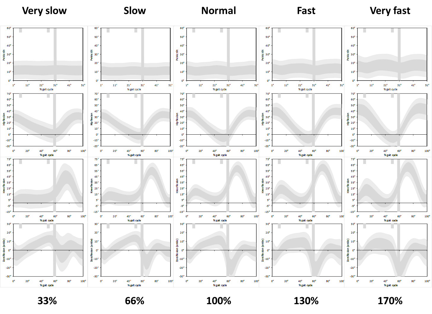
But then I realised that the slower walkers have a longer cycle time and the data should really be stretched to make comparisons as to how children are waking in real time. Slow walkers take a lot longer to complete a gait cycle than fast walkers and the data should really be plotted on wider graphs to allow comparison of what is happening over the same time period.
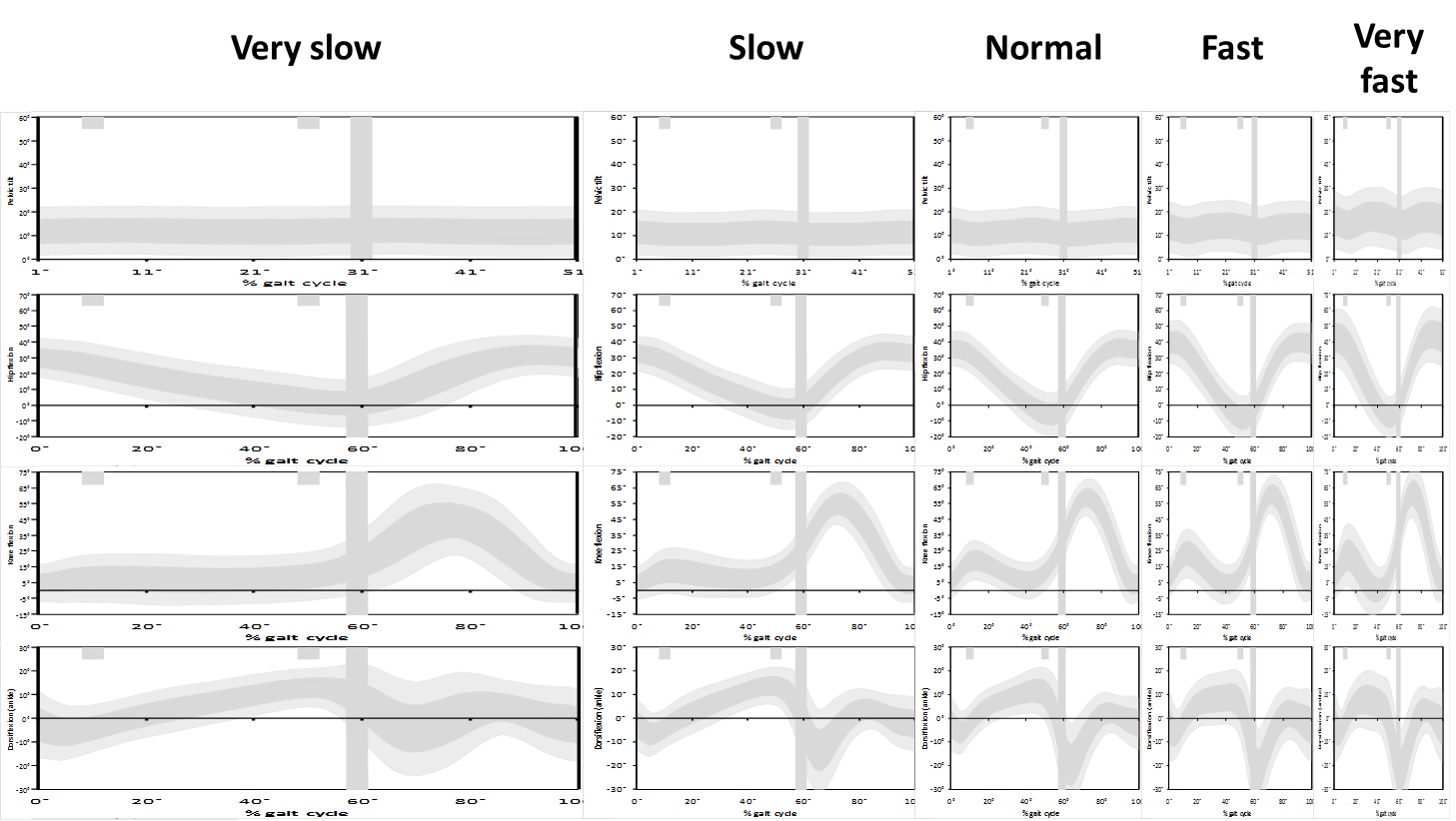
If we plot the data like this we see just how different the data really are. I’ve not absorbed the full effect or implications of this but think about the slope of the knee flexion curve in second double support and toe off which many clinicians associate with rectus femoris (mal)function. If the rectus is inhibiting knee flexion then they expect the slope to be reduced. But look at the difference between the real gradient in the lower graphs and the apparent gradient in the conventional (upper graphs). How can we possibly interpret this phenomenon from the conventional graphs?
It ‘s not clear what we can do about this. Plotting the graphs the way we do allows comparison of like with like (even if we might lose something by forcing the comparison). We often use graphs to compare outcome after intervention. How would we do this sensibly if the graphs are different shapes?
Anyone got any ideas how we can properly represent the slope data without losing the power of the straight forward comparisons we get from sticking to the tried and tested conventions for plotting data?
.
Schwartz, M. H., Rozumalski, A., & Trost, J. P. (2008). The effect of walking speed on the gait of typically developing children. J Biomech, 41(8), 1639-1650.

Hi Richard – nice blog! I also like your 2SD graphs. I don’t know how you’d solve the time warp problem, but I am reminded that time is another variable that ideally should be normalised to a dimensionless quantity: dimensionless time = time in seconds * √(l/g) where l = lower limb length. I’ve never seen anybody do this?
Oh, small mistake!: should be time in seconds / √(l/g)
Hi Richard,
I suggest to use time wraping solutions to solve this problem. A very nice paper for this: Helwig et al. 2011 in JB – http://www.ncbi.nlm.nih.gov/pubmed/20887992
If the first derivative (velocity) is the quantity of clinical interest, then why not plot this rather than trying to extracts it from a time distorted graph? The answer maybe that our software producers do not make this information readily available? This may also answers the ‘where is the foot’ problem in the previous blog. CODA software for example automatically produces sagittal, coronal and transverse ankle and foot kinematics.
Hi Richard,
Very interesting. Another issue I have that is related is the time normalization of a single subject’s bunch of trials in order to produce an average curve (similarly, when averaging time-normalized trials to obtain normal curves etc.). It seems to me that by normalizing to a percentage of gait cycle and then averaging at each percentage point, you’re assuming that the proportion of say, the swing phase to the stance phase, is constant i.e. you’re assuming that the points being averaged from each graph relate to the same point in the physical walking motion (for instance peak knee flexion). Of course this is not always true, and it could possibly lead to parts of the swing phase in one trial being averaged with parts of the stance phase in another right? More importantly, it could alter the shape of the standard deviation band, since if some of the knee flexion peaks normalize to an earlier percentage point than others, you might actually get a ‘double bump’ on the SD band that never actually happened in one the trials. Any thoughts on this?
John,
Good points. Similar ideas have been proposed for some time but have not really caught on clinically. I first became aware of this with a paper from Paul Allard’s group at the University of Montreal (Sadeghi et al. 2000). There’s also been a fairly recent paper in the Journal of Biomechanics (Helwig et al. 2011). Must admit that I’ve not kep particularly up to date on what is going on in this area. The bottom line is that you’ve got to have sufficient commonality between gait pattern for the temporal alignment to work which is difficult to guarantee across a range of pathologies. You also need to be careful that differences are not clinically important – it might be useful to know that peak knee flexion is occuring later in a particular patient.
It does bring out the point that ensemble averaging (the usual way we do things) will always smooth curves a little and under-estimate the magnitude of peak signals. The sharper the peaks (or troughs) the more likely there is to be a problem). It may well be that curve registration of the normative data makes particular sense as we so often compare individual trials which are clearly not subject to the same smoothing effects of the processing that the normative ranges have been.
Helwig, N. E., Hong, S., Hsiao-Wecksler, E. T., & Polk, J. D. (2011). Methods to temporally align gait cycle data. J Biomech, 44(3), 561-566.
Sadeghi, H., Allard, P., Shafie, K., Mathieu, P. A., Sadeghi, S., Prince, F., & Ramsay, J. (2000). Reduction of gait data variability using curve registration. Gait Posture, 12(3), 257-264.