walking speed

Walking faster makes you live longer

A study that has just been published in The Lancet proposes a short questionnaire (11 questions for men , a different 9 questions for women) to assess your risk of dying within the next five years. If you want to complete the questionnaire and calculate your “Ubble age” you can just click here. One of the questions is:

How would you describe your usual walking speed?

  • Slow pace
  • Steady average pace
  • Brisk pace
  • None of the above

With the clear implication that your walking speed affects your risk of dying. What a godsend for our field. If merely asking people to categorise their walking speed on this four point ordinal scale works then imagine how much more accurate that prediction would be if we actually measured it? I can imagine gait analysis services all over the world opening up their doors to supplement their incomes by calculating people’s death risk on the basis of walking speed. More seriously I wonder how long it will be before we see this article being cited as part of the evidence base for proposals to support further research into the link between walking speed and longevity. It’s published in a very highly rated journal.

But let’s unpick the study a little bit. It is based on data from the UK Biobank project. Half a million participants thought to be representative of the UK population were enrolled and 655 measures of demographics, health and lifestyle were recorded. These individuals have then been tracked for five years to see which ones died. On this basis the 655 measures were ranked by how strongly they predicted death. Some of these are obviously very highly associated (there are for example several different ways of measuring smoking) so  the authors have selected a range of the strongest unrelated predictors of death on which to base their questions. So far so good – there is a robust scientific methodology which selects walking speed as one of the strongest predictors of death.

But one of the wonderful aspects of this study is that the data has been presented in a format that allows you to probe the data on which the study is actually based.  It is based on the hazard ratio which is the risk of dying for each answer divided by the “reference” answer (in this case walking at “steady average pace”)

The table looks like this:

Category Hazard ratio [95% CI] Deaths P-value
Steady average pace 1.0 (reference) 2653 Reference
None of the above 2.7 [1.9-3.8] 33 1.5 x 10⁻⁸
Slow pace 2.8 [2.6-3.0] 1275 3.3 x 10-198
Brisk pace 0.7 [0.6-0.7] 1165 1.8 x 10⁻²⁸
Unable to walk 4.6 [3.7-5.6] 98 2.9 x 10-49

Note that brisk walking reduces risk of dying to 70% of the reference value but that slow walking increases it to 280%. Slow walking is thus a much stronger sign that you are more likely to die than brisk walking is that you are less likely to die. This is confirmed to a certain extent by the p-values. With such a large study getting high p-values is almost inevitable so I’d ignore the absolute values, but the relative values show that that the association with slow walking is much stronger than that with brisk walking.

And why do people walk slowly? Well most people who walk slowly will do so because they have a health condition that prevents them from walking at a “steady average pace”. It shouldn’t really surprise us that people with pre-existing medical conditions are more likely to die than those without. This is confirmed by the final row of the table above which shows that the risk shoots up even higher for people who are unable to walk at all (indicative of a much more serious health condition).

To my mind the most sensible interpretation of this observation is that walking speed is important as an indirect indicator of a pre-existing medical condition rather than a parameter of strong predictive value in its own right. This is backed up by the observation that the strongest single predictor or death is the extremely simple question – “In general how would you rate your overall health?”. People who consider themselves healthy are less likely to die than those who don’t!

This is further confirmed by restricting the analysis to “all cause mortality in healthy individuals” in which case the prediction value of walking speed falls off dramatically and lines up with a range of other fairly weak predictors. (If you do this yourself don’t be fooled by the change of scaling on the vertical axis which hides this to some extent). In other words if you restrict the analysis to people who don’t have a pre-existing medical condition then walking speed is a much weaker predictor of death.

So my suggestion is that we don’t all rush out and set up death predicting services to augment our income – or if we do that we do it extremely cynically and exhort as much money as possible from the people that are gullible enough to pay it.

Advertisement

Plotting to convince

This post has been prompted by Mike’s comment on my last post. He pointed out two papers (Holt et al. 1991 and Minetti et al. 1995)  that have investigated the relationship between stride frequency and oxygen rate (per time) when walking at constant speed on a treadmill. The papers come up with the two graphs which I’ve included below (Holt et al. on the left, Minetti et al. on the right).

Minetti Holt

In many ways I’m more interested in how the data is plotted than by what the results actually are.

Both show a u-shaped realtionship but that on the left gives the impression of a rather broad curve with a poorly defined minimum whereas that on the right tends to suggest a much deeper curve with a well defined minimum. The graphs look very different to me to the extent that I might even interpret the data differently. I might interpret the left hand graph as suggesting that you can vary your stride frequency between about 0.9 and say 1.1 Hz without making much difference to oxygen rate. The message I might take out of the right hand graph is that oxygen rate is highly dependent on frequency with a clear minimum at a little under PSF+5.

But then I realise that the axes are quite different. From the Holt paper we find that PSF is 57 strides per minute (0.94 Hz) so the range from PSF -15 to PSF+15 is from 0.7 and 1.2 Hz and we also find that the average weight was  70 kg so the range of VO2 (0.8-1.4 l/min) corresponds to about 11.5 – 20 ml/min/kg. We can use this information ot overplot the graph of Holt et al. onto that of Minetti et al.:

Minetti holt

The data shows reasonable agreement given that the studies are not identical (and we have no way of knowing if the walking speeds were similar as this is not even recorded by Holt et al). What interests me is that conclusions are reversed. The data from Holt et al which appeared to show such a well defined minimum is even more broadly distributed than that from Minetti et al.

Conclusion one is that whilst there is a minimum in energy rate at about the preferred cadence this minimum is quite broad and with little change over quite a range of values either side of the minimum. Conclusion two is that choices in how you plot results can have quite a pronounced effect on how they are interpretted.

.

PS. For those of you who didn’t follow the comments yesterday this analysis is of oxygen rate with cadence at fixed speed is related to but different from the question of whether oxygen cost has a minimum value at self-selected walking speed which was the main focus of yesterday’s post.

.

Holt, K. G., Hamill, J., & Andres, R. O. (1991). Predicting the minimal energy costs of human walking. Med Sci Sports Exerc, 23(4), 491-498.

Minetti, A. E., Capelli, C., Zamparo, P., di Prampero, P. E., & Saibene, F. (1995). Effects of stride frequency on mechanical power and energy expenditure of walking. Med Sci Sports Exerc, 27(8), 1194-1202.

Walking in the groove

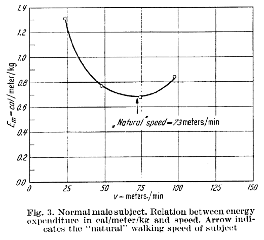
While I surfing the web doing a bit of background reading for last week’s post I came across this graph.

Ralston HJ (1958) Energy-speed relation and optimal speed during level walking. Int Z angew. Physiol. einschl. Arbeitsphysiol. 17 (8): 273-288.

Ralston HJ (1958) Energy-speed relation and optimal speed during level walking. Int Z angew. Physiol. einschl. Arbeitsphysiol. 17 (8): 273-288.

It’s another of the classic outputs of Verne Inman’s group, from Henry Ralston, and shows data for a healthy subject to support his hypothesis that we select our walking speed to minimise the energy cost of walking (the energy used to travel a certain distance). The hypothesis is so plausible that it has been almost universally accepted.

What interests me is that despite being so widely accepted I’ve never seen any suggestion of the mechanism through which we might achieve this. It’s a fairly basic principle of control theory that if we want to minimise any particular variable (such as distance walked for a given amount of energy) we need some way of measuring it. Thus it is very difficult to drive a car fuel efficiently if you just have a speedometer and a standard fuel gauge. If you add a readout to the dashboard telling you how much fuel you are using per kilometre travelled and the task becomes trivial. They should be compulsory in a fuel challenged world!

I’m not aware of any proprioceptive mechanism that would allow the brain to “know” how much energy it is using per unit distance walked. I can see that there are complex mechanisms regulating cardiac and pulmonary rate based primarily on carbon dioxide concentration in the blood which might allow us to sense how much energy we are using per unit time, but how can we possible sense how much energy we are using per unit distance. I’m not saying it’s impossible – the brain is a marvellous organ and it is possible that it integrates such a measure of energy rate (per unit time) with information about cadence and proprioception of joint angle and in order to derive a measure of energy cost (per unit distance). This is a complex mechanism however and certainly suggests that, as with so much in biology, whilst the basic hypothesis is extremely simple the mechanisms required to achieve this is far more complex than we might have imagined. As Ralston himself put it, “one of the most interesting problems in physiology is to elucidate the built in mechanism by which a person tends to adopt an optimum walking velocity such that energy expenditure per unit distance is a minimum”.

But this also makes me want to question the underlying hypothesis. Going back to the original paper (which you can read here), Ralston only produces data from one healthy subject and one amputee to support his hypothesis. I’m not aware of many others having explored the hypothesis on an individual level (the conclusion that the self-selected walking speed is close to speed of minimum energy cost for a sample does not mean that the relationship holds for individuals within that sample). I’d be interested to hear from readers of papers that have investigated this relationship in more detail.

The other point that Ralston made which is almost always overlooked is that the curve is “almost flat”. The curve only looks so steep because it has been plotted over such a wide range of values (from 0 through to 150m/s). Just looking at the data plotted I’d suggest that the speed can range from about  56 to 84 m/min whilst the energy cost remains within 5% of the minimum energy cost value. This is almost certainly within the range of measurement error for a variable such as energy cost. In other words the really remarkable thing about the energy curve is that it allows us to walk over quite a range of speeds without having a measureable effect on our energy cost. It is interesting that Ralston managed to make this point and suggest that we select walking speed to minimise energy cost in the same paper!

Taking it slowly

Hi, I’m back, refreshed from a family holiday in France and Spain and invigorated by an excellent ESMAC conference in Glasgow. Thanks to so many people that used the opportunity to say how much they liked the blog – I suppose I better keep going. The view counter passed 10,000 earlier today so let’s see if we can keep it ticking over.

I’ve no doubt that, for clinical gait analysts, the most important paper published over the last decade is Mike Schwartz’ study on the effect of walking speed on gait variables (2008). It’s the only paper that I maintain a link to on my desktop and I rarely interpret any patient data without referring to it. If you haven’t already done so then download it now and do the same (let’s see if we can knock Tom Novacheck’s [1998] review of running biomechanics off the top of the Gait and Posture most downloaded papers table and replace it with a genuine scientific study!).

walking speed

In the study quite a lot of kids were asked to walk at a range of walking speeds. The resulting gait trials were divided up into five groups by walking speed and the average gait variables for the different groups were calculated. The darker the blue in the figure above the faster the walking with the middle trace representing self-selected walking speed. You can see that the gait traces change quite considerably with walking speed even when there is nothing wrong with the child.

We were looking at data from a patient with a rare genetic disorder today. I think if I’d looked at the same data ten years ago I’d have made all sorts of pronouncement on his gait impairments. Now I just look at Mike’s paper and can say, “Yep, he’s walking slowly”, not only that but, “he’s walking slowly in exactly the same way as anyone else would walk slowly”.  It might be worth trying to work out why he’s walking slowly but there is no evidence in the gait data of any specific impairment that is affecting his walking.

I was chatting about this in the group and talking about how we walk with different gait patterns at different speeds and one of my colleagues asked quite, “Why?”. It’s one of those simple questions that caught me completely unawares and started me thinking.

Kinematically, there is absolutely no reason why anyone shouldn’t walk more slowly by having exactly the same pattern of movement but simply going through that pattern more slowly. You could thus walk slowly in a way that gives exactly the same gait graphs (after time normalisation, see previous post on this). The answer of course is that walking is not primarily driven by the kinematics but the kinetics. The way that energy flows between the segments and the way this is mediated by muscle activity depends very much on how fast the segments move. Kinetic energy is proportional to the square of speed and forces and moments act to produce accelerations.  Walking slowly efficiently requires quite different dynamic mechanisms to walking quickly efficiently.

Although this answers the question at one level it only does so partially. What would be really interesting would to be to look at how the curves change with speed from the context of how we understand the process of normal walking and see if we can explain why the gait pattern varies the way it does. Anyone who can do this easily and comprehensively has a better understanding of normal walking than I do. I’m going to have to go away and think about this.

One thing that I think would be quite instructive would be to try and do this practically. Stick some markers on yourself and record yourself walking normally. Then try and see if you can walk slowly but in the same kinematic pattern (after time normalisation). I wouldn’t mind betting that it’s not possible. Even if it is possible to match the kinematics this will require quite different kinetics and muscle activations. You may even be able to feel which muscles you are having to use differently. I suspect there’s be  a huge amount to learn from such an exercise.

 .

Novacheck, T. F. (1998). The biomechanics of running. Gait Posture, 7(1), 77-95.

Schwartz, M. H., Rozumalski, A., & Trost, J. P. (2008). The effect of walking speed on the gait of typically developing children. J Biomech, 41(8), 1639-1650.