So far the examples I’ve given have been trivial to illustrate concepts and show you how to calculate the SEM. This section describes a much more comprehensive analysis of the results of a repeatability study in which ten participants were each tested on three occasions by each of three assessors. I’ve performed the analysis in an Excel spreadsheet (a-more-complex-and-realistic-example) in order to illustrate the techniques most transparently but I would strongly recommend that any such analysis is implemented using a proper programming language or statistical package. Mistakes are almost inevitable when using a spreadsheet and the programming is not difficult particularly difficult once you understand the concepts.
The raw data is arranged as suggested earlier (link) with the repeat measurements in rows and the time series data in columns (this is on the “Raw data” worksheet). There is a lot of data because we have 6 trials from each of 3 assessors for three sessions with 10 participants (6x3x3x10 = 540 columns!). There are 101 rows because the data has been time normalises to percent of the gait cycle. The analysis described is only for the dorsiflexion and equivalent independent analysis will be required for any other gait variables.
I’m a great believer in trying to visualise data as often as possible as part of quality assurance. For each day (three sessions, each with a different assessor) the data is over-plotted with a different colour for each assessor.

The normative data ranges in the background is the mean +/- one standard deviation range for the entire dataset (all 540 trials). You can see that on this particular day all three assessors agreed reasonably closely with each other but that all the traces look quite different from the normative data (with very little plantarflexion in second double support or early swing). This is likely to be because the participant has a moderately abnormal gait pattern (but could be due to measurement error common to all three assessors).
We are not particularly interested in the trial to trial variability within a particular session so the next step is to calculate the average trace for each session (for each assessor, see worksheet “Session averages”). Doing this it becomes practical to plot all the data for each participant on the same graph.
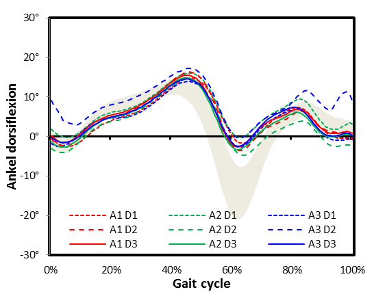
This is the complete data for the same participant in the earlier graph. You can see that assessor 3 has obtained quite different results on day 2 (– – – – A3 D2) but that other than that there is good consistency between the sessions. On none of the days does the participant exhibit much plantarflexion suggesting that this is a characteristic of how he walks.
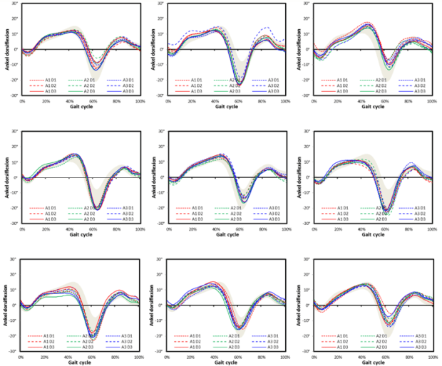
The data shows occasional outlying traces but a pattern of good consistency within each participant. There is some variability between participants and the data for the first patient simply appears to be at one end of this spectrum.
There do not appear to be any systematic differences between the assessors (who are always plotted in the same colour) and when all the data from all the participants are combined (below and at the extreme right end of worksheet “session data”) is displayed the lines for each are almost indistinguishable suggesting they are, on average, all placing the markers similarly. (Note that I am still writing a more formal description of a quantitative between assessor analysis).

The standard deviation of measurements from each participant can be calculated easily and combined to give the SEM. Combining data from all assessors gives the overall SEM and from each assessor separately gives the individual assessor SEM (worksheet “SEM”). The results of this across the gait cycle are given in the figure below (and on worksheet “Report”).

It can be seen that assessors 1 and 2 perform quite similarly and that assessor three is a little more variable. The overall SEM represents lies in between (as an RMS average should). Careful inspection of the figure shows that the SEM is greatest where the gradient of the slope on dorsiflexion is greatest (either positive or negative). This is because the data is most sensitive to subtle changes in timing from stride to stride at these times (this can be seen if you look at the individual patient graphs above in detail). This is more likely to be a consequence of the variability in how participants walked during the different sessions and not of variability in marker placement. This suggests that the low points of the curve give a better indication of marker placement error than the peaks. Using the average of a summary measure of repeatability will thus tend to over-estimate the variability due to marker placement error by a small amount.
The average values are tabulated below:

Which confirms the visual impression from the graph above.
