Uncategorized

Who first thought of a gait graph?

Quite out of the blue Jenny Kent from Headley Court asks if I know where the gait graphs we know today come from. She was particularly interested in where the idea of time normalising data to the gait cycle originated. I have to admit I just don’t know.

Braune and Fischer, working at the end of the 19th century, certainly plotted a number of gait variables against time, most for swing but a few for more than a gait cycle. All the graphs I can see though plot these against time rather than a percentage of the gait cycle and the data for more than a gait cycle doesn’t appear to be plotted in relation to the gait events at all.

The first group that I can find that present variables on graphs with the time axis labelled as % gait cycle is Inman’s group working in Berkeley in the early 1950s.

Inman time normalisation

Data scanned a long time ago from one of the outputs of the Berkeley group – not sure which.

Can anyone provide any earlier examples?

.

This made me think about other features of our standard gait graphs. Who first proposed plotting data from a patient against normative reference data depicted as a mean and range based on the standard deviation?

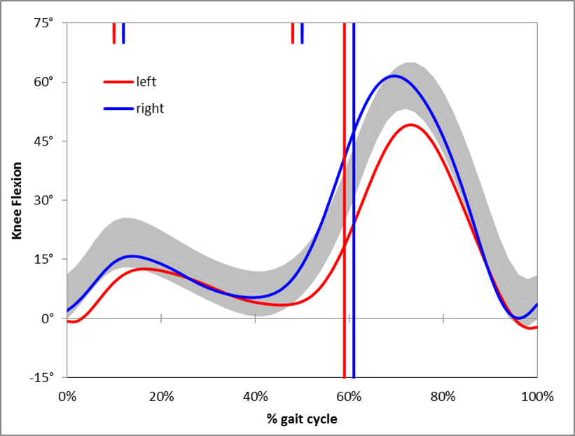
I remember that when the Vicon Clinical Manager software came out in 1992 that it assumed that all data was normalised to the gait cycle (the data was actually stored in a .gcd file on this assumption). The software only allowed three traces to be plotted on any graph so the common practice was to plot the mean of the reference data along as one right and one left side trace for each patient. I think the practice of plotting several (three!) traces from each side separately to assess measurement variability probably dated to this time as well. I don’t remember the standard deviations being plotted but this may just be my memory (the standard deviation values could certainly be stored in the .gcd file).

I also remember being impressed by teaching material from Newington and Gillette Hospitals (Gage, Davis and Ounpuu) which plotted the standard deviation ranges from quite an early stage. Looking up some of their early papers I find that  Sylvia’s 1995 paper contains sample patient data plotted against the standard deviation ranges. (Unfortunately the quality of this figure in the .pdf file I have is too poor to be worth reproducing here).

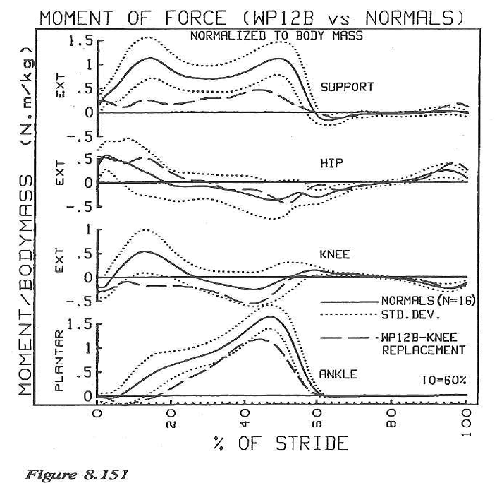
Sylvia moved to Newington from Waterloo so I wondered how David Winter had plotted his data. Sure enough in the final chapter of The Biomechanics and Motor Control of Human Walking (1991) entitled “Assessment of pathological gait” are a series of graphs showing gait variables from a patient with a knee replacement plotted against the mean and standard deviation from a reference population. (This book was an adaptation of an earlier one form 1987 which I don’t have access to and I’d be interested to know if these graphs were included in that as well).

 winter gait graphs

I’d like to suggest that this might be the earliest example of gait graph as we use them today – or has anyone got any earlier examples?

Of course tracing ideas back like this is a slightly ridiculous activity because such graphs  often appear in publications only after having been used more generally for a considerable period. Just because they first appear in print from one team does not necessarily mean that they originated there!

.

Braune, W., & Fischer, O. (1987). The Human Gait (P. Maquet & R. Furlong, Trans.). Berlin ; New York: Springer-Verlag.

Klopsteg, P. E., & Wilson, P. D. (1954). Human Limbs and their Substitutes. New York: McGraw-Hill.

Ounpuu, O., Davis, R., & Deluca, P. (1996). Joint kinetics: Methods, interpretation and treatment decision-making in children with cerebral palsy and myelomeningocele. Gait and Posture, 4, 62-78.

Winter, D. (1991). The biomechanics and motor control of human gait: Normal, Elderly and Pathological (2nd ed.). Waterloo:: Waterloo Biomechanics.

Why do we collect normative data?

The sun is still shining in Cincinnati although many of us in the conference hotel are seeing very little of it. Thought I’d share the podium presentation I’ve just made which reflects on why it is that we collect service specific normative reference data. It’s my feeling  that this should be to allow us to compare data between services in order to develop consistent practices rather than as a way to allow us to continue to tolerate differences in the way different services make measurements. Anyway if you want to you can listen to the screen cast below.

There was an interesting technical extension to the work which I was unable to include in the presentation because of tht time limit. This is covered in the screen cast below.

Making nice gait graphs in Excel

This is quite a simple post with a tutorial screencast of how to format gait graphs nicely in Excel. For a long time I just didn’t think this was possible but you can see from the image below that it is! The screencast is the simplest example of a range of tools we are developing to support students who enrol on ourmaster’s degree programme in clinical gait analysis which starts in September as part of the EU funded CMAster project.

Nice gait graph

The main thing that makes plotting the graphs like this possible is that you can select different series within the same chart to have different chart types. I suspect that this feature may not be available in early versions of Excel but don’t know when it was introduced – this graph was generated in Excel 2010 on a PC. If you are good at working with charts in Excel then this is all you really need to know and watching the screencast will only waste another 20 minutes of your life. If you are not then I suggest you just watch the screencast and I’ll explain things a bit more slowly.

One top tip I’ll offer – if you want to create an array of graphs make sure that your formatting is correct on the first graph before you start copying and pasting. If you find a mistake later on you’ll have to correct it on each graph separately.

I’ve said in the screencast that I’ll produce another one to show how to add in the timing data. The only way I know to do this is a little bit messy. Does anyone know a nice straightforward way?

(Note that the screencast is recorded in reasonably high definition but you may have to use full screen display and increase the resolution with the little cog icon at the bottom left of the video to appreciate this.)

Re recycling terminology

My second post on this blog was a suggestion that, when you think about it in detail, there are some problems with the conventional terminology that clinical gait analysts use to divide the gait cycle into phases and that a very simple scheme based upon simple division of the gait cycle into single support, double support and swing might have some advantages. Here is a video I’ve developed to help gait analysts reflect on the issues.

Averaging up the profits

Here are two graphs. The first from very early in my career shows a parameter we called the “dynamic component” of gastrocnemius length. It plots the improvement in this after injection of botulinum toxin in children with cerebral palsy against the baseline score (Eames et al., 1999). I remember when Niall first showed me the graph. We’d captured a  whole load of data on these kids and were wondering what to plot to make sense of it. This was the first suggestion and I can still remember Niall’s excitement when it came up with such a strong relationship.

Eames

At the other end of my career here’s another graph from a paper that has only just been published electronically in Gait and Posture (Rutz et al. 2013). Here is the improvement in Gait Profile Score (GPS, Baker et al., 2009) for children with cerebral palsy plotted against baseline score (with GMFCS II and III children plotted separately). Again there is a strong correlation. (There are some statistical issues in plotting data this way which might lead to exaggeration of the correlation when measurement error is substantial but I’ve gone to some lengths in the recent paper to show that this is unlikely.)

rutz

When you think about it though the relationship is actually quite unremarkable. What both studies are showing is that kids with the most severe problems to start with are the most likely to show improvements. To a certain extent this is common sense – if two kids both improve by 30% then the child with the biggest problem to start with will show the biggest change in absolute units.

What interests me though is that if we only look at the average changes in each group we will reach the conclusion that the group as a whole have improved. If we are not careful we might conclude that all the group has improved. Thissimply isn’t the case. The full truth is that the kids who have the biggest problems have improved a lot those with milder problems haven’t improved very much (in absolute terms).

The Botulinum toxin study became the basis for an industry sponsored randomised controlled trial (Baker et al. , 2002). In that trial although we included baseline readings as a covariate in the statistical analysis but we only ever reported group results. That is still probably the most rigorous trials of lower limb injection of Botulinum Toxin in the literature. The message that almost everyone has taken out of that study  from the data we presented is that kids with spastic diplegia will benefit form Botulinum toxin. Had we presented the data more carefully the conclusion should have been that the more severely affected kids will benefit from Botulinum Toxin big time, but that  the milder kids may not benefit at all.

As it stands the paper is really convenient for the company because it suggests that a wider group of kids will benefit from an expensive drug than is actually the case. Given that bigger responses to treatment in more severely affected people is likely in almost all conditions that affect people across a range of severity I suspect that a similar phenomena spread across almost all of . I wonder how much profit the drug companies are making as a consequence?

Leave a comment or double click “n comments” link at top of post to view discussion.

Baker, R., Jasinski, M., Maciag-Tymecka, I., Michalowska-Mrozek, J., Bonikowski, M., Carr, L., . . . Cosgrove, A. (2002). Botulinum toxin treatment of spasticity in diplegic cerebral palsy: a randomized, double-blind, placebo-controlled, dose-ranging study. Dev Med Child Neurol, 44(10), 666-675.

Baker, R., McGinley, J. L., Schwartz, M. H., Beynon, S., Rozumalski, A., Graham, H. K., & Tirosh, O. (2009). The gait profile score and movement analysis profile. Gait Posture, 30(3), 265-269.

Eames, N. W. A., Baker, R., Hill, N., Graham, K., Taylor, T., & Cosgrove, A. (1999). The effect of botulinum toxin A on gastrocnemius length: magnitude and duration of response. Dev Med Child Neurol, 41(4), 226-232.

Rutz, E., Donath, S., Tirosh, O., Graham, H.K., Baker, R. (2003). Explaining the variability improvements in gait quality as a result of single event multi-level surgery in cerebral palsy. Gait Posture, published on-line http://dx.doi.org/10.1016/j.gaitpost.2013.01.014