Hi, sorry its been so long since I posted but I’ve been reinvigorated by this year’s ESMAC conference here in Heidelberg. Earlier in the week I had the pivilege of sitting in on a session of the ESMAC gait course. Julie Stebbins had arranged a short quiz to start people thinking on Wednesday morning and the last question caught my attention. It’squite simple. There are four sets of kinematics along the top and four of kinetics along the bottom labelled A to D. What order do the kinetic datasets need to be arranged in to match the kinematic graphs (and why)? (You should be able to get a bigger view by double clicking on the picture.
biomechanics
A bit of a work out
While still reflecting on the way we use terminology so misleadingly within gait analysis it might be worth thinking a little about the concept of external work. It’s a concept that is even older than I am. Although previous workers (notably Fenn and Elftman) had used similar concepts it was Giovanni Cavagna who popularised it with his classic paper from 1963. (Cavagna et al. 1963). The article starts with the sentence, “The work performed in walking can be considered as being made of two components, the internal work and the external work”. My response to this is that you can consider it like that if you want but you are likely to confuse people if you do!

Graphs from Cavagna’s 1963 paper showing how horizontal components of speed and displacement are calculated from acceleration data. Note that his data was taken from an accelerometer worn on the body whereas it is more common these days for similar techniques to be used based on force plate measurements.
Let’s be clear that there is no external work in walking. All the work required for walking is generated internally by the muscles. The result of muscles (and ligaments) exerting forces on the skeleton is that the foot exerts a force against the floor and generates the ground reaction (following Newton’s third law) but the ground reaction itself doesn’t do any work. It can’t. In order for a force to do work the point of application needs to move and the ground doesn’t move (well, not very often).
Whether its name is correct of not, the concept is important because it allows an estimate of the energy cost of walking on the basis of force plate measurements alone (cuts out all that nasty kinematics). The theory behind the calculations is generally presented as straightforward but actually requires some quite subtle reasoning.
Although the ground reaction doesn’t do any work, it is a force applied externally to the body and will result in the centre of mass of the body being accelerated (Newton’s first law). If we measure the ground reaction we can thus calculate this acceleration and thus how the centre of mass is moving (its velocity and displacement).
Now if we wanted to move an equivalent mass through the same trajectory we could do so by applying an external force of the same magnitude and direction as the ground reaction directly to its centre of mass. If we did this then the point of application of this imaginary force would move and it would do work. Knowing the laws of physics it is reasonably easy to calculate what this work would be.
This can be taken as equivalent to the work that the muscles have to do to move the centre of mass, but it should be emphasized that the external force applied at the centre of mass is entirely imaginary, for the purposes of the calculation only. All the work is done internally by the muscles.
Of course this is one of those areas where people who understand the underlying concepts can cope with the fact that the name is wrong and get on with life … but I suspect that the terminology has the potential to be extremely misleading for those who don’t.
Additional note. It may also be worth being explicit that the muscles do other things as well as moving the centre of mass. They also move the segments with respect to the centre of mass and the work required to do this is not captured in the calculation outlined above. The calculation will thus always be an under estimate of the true mechanical cost of walking. It’s interesting that despite the extent to which these techniques have been used there have been very few studies of how much of an under-estimate, either for normal walking or for walking with pathology of different kinds.
How long is a piece of string?
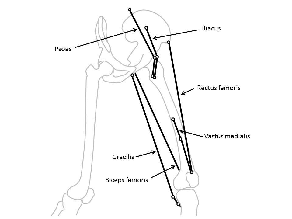
Lurking somewhere on this blog-site is software that Vicon users can download to calculate “muscle lengths”. It’s based on calculating the distance between the origin of a muscle on one segment and its insertion on another as illustrated in the diagram below (taken from my book). Some of the muscles (such as the rectus femoris) can be best represented as a straight line between the origin and insertion, whereas others (such as psoas or iliacus) have to pass around bones and may be better represented by including a “via point” along the path and adding the lengths of the two lines thus created.
Clearly as the joint or joints linking the relevant segments move this distance changes and you can thus plot muscle length on gait graphs in the same way that you can plot any other gait data. The technique has been around for a very long time but has been particularly popular since Scott Delp’s work on SIMM in the late 1980s.
Recently Jussi has added a comment to the page first saying that he’s got the software working (good) but then that a “somebody” has suggested “that ‘point-to-point’ muscle length models tend to be inaccurate, and a joint angle/moment arm based methods would be more accurate”.
This is quite an interesting comment because I don’t really consider this technique as “accurate”. The technique is based on a rather crude scaling of one set of origin and insertion coordinates. We don’t really know how consistent these are across healthy individuals and certainly not how they are affected in people with the sorts of conditions that we generally assess in clinical gait analysis (particularly those with bone, joint or muscle deformity). Further the calculations are dependent on the assumptions you make about how the joints move and ultimately on the accuracy of the joint angle measurements. All in all this is probably best described as a technique to “estimate” muscle length rather than to “calculate” it.
My general advice for clinical interpretation is that if you are dealing with single joint muscles then the muscle length graphs don’t really tell you much that you can’t already see on the joint angle graphs. Generally as a the joint extends the extensors get shorter and the flexors get longer (and vice versa) and the muscle length graph looks extremely similar to the corresponding joint angle graph (but with different units). Given that the actual calculations of muscle length are subject to so many assumptions you might as well work directly from the joint angle graphs.
The multi-joint muscles are different though because the muscle length depends on the orientation of both joints and the separate moment arms of the muscle about each. It is thus virtually impossible to assess how the muscle length varies through the gait cycle. In this case muscle length graphs are the only sensible way of getting an insight into how a muscle is behaving and can be valuable despite knowing that the actual values are only estimates. At least they are consistent estimates so that there is some sense in comparing the data you estimate for a patient against normative data which you have estimated using the same modelling procedure.
The most obvious example of this is in considering hamstrings length in children with cerebral palsy. It is extremely tempting to see a bent knee and assume that the hamstrings must be short. The “obvious” surgical response is to lengthen them. In many kids, however, the hip is also flexed and, because the moment arm at the hip is greater than that at the knee the muscles is often actually considerably longer than “normal“. This would suggest that surgical lengthening is inappropriate. Scott Delp and Alison Arnold drew the attention clinical community to this nearly twenty years ago and if there is one good reason for including muscle length estimates in gait reports for kids with CP then this is it. The data doesn’t have to be that accurate to be a reminder to surgeons that this is an important issue.
In direct response to Jussi’s question I don’t think its possible to say whether “point-to-point” or moment arm based calculations are more accurate. The calculations are affected by different factors and its not at all clear whether either is superior in general. The accuracy of whichever technique you use will be dependent on the quality of the input data (point coordinates or moment arms). As pointed out above accuracy is limited by a number of other factors and some of these may be more important than the choice of technique. Perhaps most importantly I’m not aware of any research that has ever been done to assess the accuracy of any muscle length calculations (though there is at least one that investigates the difference in results from a using a number of techniques ).
Of course this assumes that muscle lengths are being used clinically to understand why a patient walks the way they do. Anyone wanting to use them for more technical purposes perhaps in the generation of more advanced muscuol-skeletal models really needs to develop an in depth appreciation of all these factors for themselves.
.
PS Just to avoid the terminology police its worth reminding people that what almost everyone refers to as “muscle length” is actually the musculotendinous unit length. Maybe this is something that should have been added to my rant on terminology last week.
Spoonful of sugar: a re-think
One of my earliest posts was about how efficient walking is and how little energy it takes to walk around. I illustrated this by the observation that it takes only the energy contained in two heaped teaspoons of sugar to allow an average adult to walk for a kilometre at a comfortable pace. After mentioning this as part of a tutorial I gave last month at the Gait and Clinical Movement Analysis in Portland several of us sat on chatting about whether this is a small amount of energy or not.
There is a problem in trying to think about how efficient walking is in that efficiency is generally defined as the energy output by a system divided by the energy that is input to a system. The problem in relation to walking over level surfaces is that it doesn’t necessarily take any energy to move an object from one point to another if it is at the same height and moving at the same speed at the end of the movement as it was at the start. Think of a perfect wheel, once we use a relatively small amount of energy to get it rolling, it will continue to roll along a level surface without requiring any energy input. If the energy output by the system is zero then it makes the calculation of efficiency a rather pointless exercise. Nothing divided by two teaspoons of sugar is nothing but so is nothing divided by one teaspoon of sugar or nothing divided by a hundred teaspoons. How can we get a handle on whether two teaspoons is a lot of energy or not?
One way might be to calculate the gradient of a slope we would have to be walking down in order for the loss in height to be provide the energy for walking rather than our bodies burning up food. Ralston’s classic paper of 1958 calculated the nutritional energy cost of walking (the amount of food energy that needs to be consumed) to be about 3.3 Joules/kg/m (assuming 1 cal = 4.186J) and more recent work that I’ve published agrees. If that energy all came from a loss of potential energy (mass x height x acceleration due to gravity) then it is quite easy to calculate that this would require a loss of 0.33m for every metre walked (=3.3/9.81). The gradient we would have to walk down would be 1 in 3 which sounds very steep to me.
But things are not quite as simple as this. The efficiency with which food energy is converted to mechanical energy is estimated to be about 20% so the mechanical work that 3.3 J/kg/m represents is about 20% of the nutritional energy cost. This energy is thus only really equivalent to walking down an 1 in 15 gradient. It is also important to remember that about half of the gross energy cost of walking comes from the basal metabolism that is required to keep your body functioning regardless of whether you are walking or not. On this basis the effective gradient should perhaps be reduced even further to 1 in 30.
So does this help? Well the 1 in 3 slope that we arrived at when just thinking about the nutritional cost is quite steep and perhaps serves as a reminder that the energy density of foods such as sugar is very high. We shouldn’t assume that just because we’ve got a a small amount of sugar that we have a small amount of energy. On balance, however, I think the 1 in 30 slope that arises when we take account of the basal metabolism and the efficiency of conversion of food to mechanical energy is a fairer reflection of how efficient walking is. This slope looks quite gentle and I think the overall conclusion that the walking is reasonably efficient is justified. The gradient isn’t however so small that it can just be ignored. The mechanical cost of walking appears to be the equivalent of raising the body mass by about 4cm more than is necessary for every stride (assuming a stride is about 1.3m long).
Demonstrating the gravity of the situation
I’ve been modifying e-Verne recently to make him a little more friendly to use on tablets and phones, particularly those running under iOS or Android (follow this link for tips). This has been in preparation for a Tutorial session I’m presenting at the GCMAS meeting next week in Portland. While I was doing the maintenance something reminded me of a picture in Braune and Fischer’s, “The Human Gait” (which was originally released in chapter form between 1895 and 1904) of a device to calculate the position of the centre of gravity of the whole body once you know the positions of the centre of gravity of the individual body segments. I scanned through through the book and this is the image that I remembered from page 127. The ingenious scaffolding mechanism moves the black spot in the centre to illustrate where the centre of gravity is.
I thought it might be interesting to add this functionality into Verne and below you can see how it looks. Use the “Mass centres” button to toggle the centre of mass positions on and off. The individual segment masses are depicted in black. The red and blue symbols are the centre of masses for the different limbs (femur, tibia and foot segments combined) and the green one that of the overall body. The area of the symbols are proportional to the mass of the different segments with the masses and centre of mass positions for the individual segments based on the data in David Winter’s book. Drag on the different segments to move them around (there are more instructions on the Verne page of this blog-site.
Whilst checking to see if I could save myself the walk to the scanner by surfing to find if the image from The Human Gait was already on-line I was fascinated to come across a similar picture.
It’s from the catalogue of the German scientific instrument maker Eduard Zimmermann published in 1904. It’s labelled as a “Schwerpunktmechanismus nach Fischer”. They obviously sold well because they are still listed in the 1928 catalogue where a fuller description is available. It doesn’t say how big this was but it weighed 4.6 kg so much have been a fair size.


