gait analysis

Push off push-off

Sheila from Dundee dropped me an e-mail: 

In your meanderings around the subject of gait have you come across any definitive descriptions of push-off i.e. at what time in the cycle does it start? Or do you have any thoughts on the matter yourself?

Having replied it struck me that others may be interested in this topic.

As far as I’m aware “push-off” is only used loosely to describe a phase of the gait cycle. I’ve never seen a definition in terms of where it starts and where it ends. My preference is to describe the phases based on single and double support and swing (with single support and swing divided into three equal parts). This intentionally avoids labelling any particular phase as having any particular function (push-off, shock-absorption etc.) partly because people often get these functions wrong when describing walking and partly because patients may not achieve such functions at the same phase of the gait cycle as the able-bodied.

“Push-off” is particularly problematic. How usefully it describes the late stance phase depends both on whether you are considering the whole body or just the leg and the direction you are talking about. During late stance the centre of mass is moving downwards and forwards. The downward motion is being resisted. From this perspective late stance is a phase of deceleration and the term “push-off” is inappropriate. The segments in the limb however are moving in different directions, the foot, ankle and tibia are being “pushed up” whereas the femur is actually moving downwards with the centre of mass.

Looking in the horizontal direction both the centre of mass and the limb are being accelerated forwards. There is a relatively small acceleration of the centre of mass (but this affects a large mass) and a rapid acceleration of the limb (which has a much smaller mass). In this context “push-off”  does appear an appropriate descriptor at first.

Focussing first on the centre of mass movement though – if you model the whole body as an inverted pendulum with mass and leg length matching the human body you find that the entirely passive mechanism (no muscle activity) develops an anterior component of a ground reaction in late stance that is very similar in magnitude to that of the ground reaction at this phase of healthy walking. This force arises because of the relative alignment of the centre of mass, limb and foot and suggests that the muscles need only preserve this alignment to generate it. “Push-off” suggests something much more active and may be misleading.

If we focus on the limb – there has been a debate for nearly 200 years about whether it is being pushed forwards by the action of the plantarflexors pushing against the ground or pulled forwards by the hip flexors. I think it very likely that both are important. It’s tempting to think that some insight into this can be gained from looking as the joint power graphs. They show power generation at both hip and ankle which tends to confirm that both are important. Power, however, is a scalar quantity (it is not associated with any particular direction) representing the rate at which energy is supplied to or removed from the whole body by the muscles acting across a particular joint. Given this it is very difficult to come to any rigorous conclusions about the relationship between the power generated at the joints and the movement in a particular direction of the segments of the limb being “pushed-off”  (to say nothing of complications when power may actually be being generated by muscles spanning more than one joint). To answer the problem categorically would require some form of induced acceleration analysis as to what particular muscles are acting to accelerate the segments during late stance. I’m not aware of anyone having done this (perhaps readers can let me know if they are).

Going back to the original question. I’d maintain my suggestion that we avoid “push-off” as a term. It’s an easy label to apply that makes us think we understand something that many of us don’t (and I’d include myself in this).
Walking in the groove

While I surfing the web doing a bit of background reading for last week’s post I came across this graph.

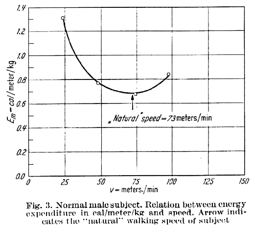
Ralston HJ (1958) Energy-speed relation and optimal speed during level walking. Int Z angew. Physiol. einschl. Arbeitsphysiol. 17 (8): 273-288.

Ralston HJ (1958) Energy-speed relation and optimal speed during level walking. Int Z angew. Physiol. einschl. Arbeitsphysiol. 17 (8): 273-288.

It’s another of the classic outputs of Verne Inman’s group, from Henry Ralston, and shows data for a healthy subject to support his hypothesis that we select our walking speed to minimise the energy cost of walking (the energy used to travel a certain distance). The hypothesis is so plausible that it has been almost universally accepted.

What interests me is that despite being so widely accepted I’ve never seen any suggestion of the mechanism through which we might achieve this. It’s a fairly basic principle of control theory that if we want to minimise any particular variable (such as distance walked for a given amount of energy) we need some way of measuring it. Thus it is very difficult to drive a car fuel efficiently if you just have a speedometer and a standard fuel gauge. If you add a readout to the dashboard telling you how much fuel you are using per kilometre travelled and the task becomes trivial. They should be compulsory in a fuel challenged world!

I’m not aware of any proprioceptive mechanism that would allow the brain to “know” how much energy it is using per unit distance walked. I can see that there are complex mechanisms regulating cardiac and pulmonary rate based primarily on carbon dioxide concentration in the blood which might allow us to sense how much energy we are using per unit time, but how can we possible sense how much energy we are using per unit distance. I’m not saying it’s impossible – the brain is a marvellous organ and it is possible that it integrates such a measure of energy rate (per unit time) with information about cadence and proprioception of joint angle and in order to derive a measure of energy cost (per unit distance). This is a complex mechanism however and certainly suggests that, as with so much in biology, whilst the basic hypothesis is extremely simple the mechanisms required to achieve this is far more complex than we might have imagined. As Ralston himself put it, “one of the most interesting problems in physiology is to elucidate the built in mechanism by which a person tends to adopt an optimum walking velocity such that energy expenditure per unit distance is a minimum”.

But this also makes me want to question the underlying hypothesis. Going back to the original paper (which you can read here), Ralston only produces data from one healthy subject and one amputee to support his hypothesis. I’m not aware of many others having explored the hypothesis on an individual level (the conclusion that the self-selected walking speed is close to speed of minimum energy cost for a sample does not mean that the relationship holds for individuals within that sample). I’d be interested to hear from readers of papers that have investigated this relationship in more detail.

The other point that Ralston made which is almost always overlooked is that the curve is “almost flat”. The curve only looks so steep because it has been plotted over such a wide range of values (from 0 through to 150m/s). Just looking at the data plotted I’d suggest that the speed can range from about  56 to 84 m/min whilst the energy cost remains within 5% of the minimum energy cost value. This is almost certainly within the range of measurement error for a variable such as energy cost. In other words the really remarkable thing about the energy curve is that it allows us to walk over quite a range of speeds without having a measureable effect on our energy cost. It is interesting that Ralston managed to make this point and suggest that we select walking speed to minimise energy cost in the same paper!

Normative databases: Part 1 – the numbers game

I get quite a few queries from people asking about how they should construct normative databases with which to compare their measurements. The first question to address is what you want the normative database for. As you’ll read in my book or in a paper that has just been accepted for Gait and Posture (based on the paper I presented at GMCAS last year)  I’m not convinced by the traditional arguments that we all have different ways of doing things and that we need to compensate for this by comparing clinical data to our own normative data. The whole history of measurement science, which really started at the time of the French revolution, has been about standardisation and the need to make measurements the same way. I don’t see any reason why gait analysts should be allowed to opt out of this.

I’d suggest that the main reason for collecting normative data should be to demonstrate that our measurement procedures are similar to those used in other labs rather than to make up for the idiosyncrasies that have developed for whatever reasons. Our paper shows that there are very small differences in normative data from two of the best respected children’s gait analysis services on different sides of the planet (Gillette Children’s Speciality Healthcare in Minneapolis and the Royal Children’s Hospital in Melbourne). The paper should be available electronically very soon (a couple of weeks) and will include the two normative datasets (mean and standard deviations) for others to download and compare with.

There are two important elements for comparison. Differences between the mean traces of two normative datasets will represent a combination of systematic differences between the participants and between the measuring techniques in different centres. If you find large differences here you should compare detailed description of your technique with that from the comparison centre and try and work towards more consistent techniques. Differences in the standard deviations represent differences in variability in the participants and in the measurement techniques. High standard deviations are likely to represent inconsistent measurement techniques within a given centre and require work within the centre to try and reduce this.

Having defined why we want to collect the data you can then think about how to design the dataset. The most obvious question is how many participants to include? The 95% confidence limits of the mean trace are very close to twice the standard error of the mean which is the standard deviation divided by the the square root of the sample size. I’ve plotted this on the figure below (the blue line). Thus if you want 95% confidence that your mean is within 2° of the value you have measured you’ll need just under 40 in the sample. If you want to decrease this to 1° you’ll need to increase the number to about 130. I’d suggest this isn’t a very good return for the extra hassle in including all those extra people.

sample size for normative data collection

Calculating confidence limits on the standard deviations is a little different (but not a great deal more complicated) because they are drawn from a chi-distribution rather than a normal distribution (see Stratford and Goldsmith, 1997). We’re not really interested in the lower confidence limit (how consistent our measurements might be in a best case scenario) but on the upper confidence limit (how inconsistent they might be in the worst case). We can plot a similar graph (based on the true value of the standard deviation being 6°). It is actually quite similar to the mean with just over 30 participants required to have 95% confidence that the actual SD is within 2 degrees of the measured SD and just under a hundred to reduce this to 1°.

In summary aiming to have between 30 and 40 people in the normative dataset appears to give reasonably tight confidence intervals on your data without requiring completely impractical numbers for data collection. You should note from both these curves that if you drop below about 20 participants then there is quite high potential that your results will not be representative of the population you have sampled from.

That’s probably enough for one post – I’ll maybe address some of the issues about the population you should sample from in the next post.

Just a note on the three day course we are running in June. Places are filling up and if you want to book one you should do so soon.

.

Stratford, P. W., & Goldsmith, C. H. (1997). Use of the standard error as a reliability index of interest: An applied example using elbow flexor strength data. Physical Therapy, 77, 745-750.


“Normal” amputee gait?

Sorry its been so long since I’ve posted – I must try and get into the habit again. Particularly as I’ve had my 200th follower sign up this week.

This post is prompted by an e-mail from Rene van Ee in Nijmegen in the Netherlands. He wrote asking my opinions about using gait indices in amputees. We’re working on collaborative research with Headley Court in Surrey with some of the recent amputees from conflicts in Iraq and Afghanistan so the issue is quite pertinent to us at the moment as well.

amputee markerset

The GGI, GDI and GPS/MAP are all essentially measures of deviations from the average healthy gait pattern. It is assumed that big deviations represent a poor quality gait and small deviations represent a high quality gait. The fundamental question is “Does this apply to amputees?”

In big picture terms, and particularly from a cosmetic point of view, I think the answer is almost certainly “yes”. We want amputees with reasonably “normal” gait patterns and big deviations from this can probably be seen as a bad thing. Many amputees, particularly young and otherwise fit soldiers with state of the art prostheses, however, walk extremely well nowadays. In this category, and particularly if you start considering the biomechanics, then the answer becomes less clear. The best way for a trans-femoral amputee to walk may not be to mimic “normal” walking as closely as possible.

My gut feeling is thus that any of the indices (they all measure deviation from normal in one way or another) will probably be useful measures of gait quality within the less able amputees but may become less useful with the better amputees. Our application is with some military amputees with very high levels of function so this is a big issue for us.

There is an argument that the human body has evolved for the joint to move in particular patterns during walking and that moving through other patterns may be detrimental. In this case measuring the deviation of the sound joints from normal may have some merit. I’d see this as a real advantage of the MAP. It allows you to see the different levels of deviation at the different joints. After that you could take the (RMS) average of the sound joints and create an index that effectively measures how well the movements of the anatomical joints mirror normal walking.

As an engineer, however, I’d expect abnormal joint loading to be at least as important as abnormal joint movement so maybe applying similar techniques to joint kinetics is more appropriate. There’s nothing to stop anyone extending the MAP to kinetics as well as kinematics. Adam and Mike have already proposed this for the GDI (Rozumalski & Schwartz,2011).

The problem with all these ideas is that they are quite complex and dependent on accepting a particular justification for any type of analysis. What I particularly like about the GPS and MAP are their simplicity and this just gets lost. There’s nothing wrong – it just doesn’t really appeal to me.

There is another way of looking at this that might have some merit. We tend to think of the control group used for the indices as “normal” walkers but an alternative would be to think of them as “optimal” walkers. In the healthy population it seems reasonable to just think of the “normal” gait pattern as optimal. It is quite possible that there is an optimal gait for amputees (if there is then there are probably several depending on the level of amputation). If you could select the optimal walkers out at each level then you could base a GPS/MAP/GDI/GGI style comparison against their data rather than against healthy “normal” walkers.

Of course you’d have to come up with some way of identifying the “optimal” walkers at each level. This might require some consideration of whether “optimal” varies with prosthetic componentry as well as amputation level. Perhaps I’ll leave that as a challenge for my readers.

Rozumalski, A., & Schwartz, M. H. (2011). The GDI-Kinetic: a new index for quantifying kinetic deviations from normal gait. Gait Posture, 33:730-732.

GPS and/or GDI? Part 4 – the equations

I’ve just been reviewing some of my earliest posts from when I first started this blog which were a discussion of the relative merits of the GDI and GPS and recognise that there is a little unfinished business. In the last of those posts I talked of the equations that allow a conversion between GPS and GDI that Mike Schwartz and I were intending to present at  GCMAS last year. I didn’t include them in the blog at the time because it seemed appropriate to make the conference presentations first. In fact we presented similar papers at both GCMAS and ESMAC.

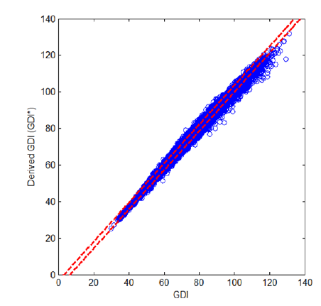
The basis of this is to acknowledge that both GPS and GDI are essentially measures of the RMS difference between two traces. GPS is a direct calculation and GDI first expresses the data as a linear combination of gait features. If this was all that was done then the RMS difference would be identical but the GDI uses only the first 15 features which results in a small difference. If we used the direct RMS differences between the two curves but applied the same scaling as the GDI we would have another measure which we’ll call GDI* which is very close in value to the actual GDI. You can see how close the agreement is from the figure below.

GDI-star

Scatter plot of derived GDI (GDI*) against original GDI. GDI* = -6.6+1.1*GDI, r2=0.996.
A new method for computing the Gait Deviation Index and Motion Analysis Profile, Schwartz MH, Rozumalski A, Baker, R. Proceedings of the Gait and Clinical Movement Analysis Society, Cincinnati, 2013.

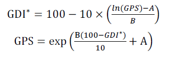
If we do this then we can also write down equations that allow a conversion from GDI* to GPS which will also be a very good approximation to the relationship between GDI and GPS. These are:

GDI - GPS equations

where A=mean(ln(ΔRMS)) and B=sd(ln(ΔRMS)) calculated over the control group used for the computation. In this case the values are A=1.677 and B=0.263. So there you go. If you want to compare your results for GDI and GPS you can now just use these equations to convert one to the other.

As a final note for Visual3D users you might be interested to know that the C-Motion web-site now includes a tutorial on how to create a pipeline to calculate the GPS. It’s all gobbledygook to me. I’d be interested to hear of anyone who may have used it though.

Have a happy Christmas. I think its unlikely I’ll get another post out before next Wednesday now and even less likely that anyone will be interested in reading it if I did.