Spot the difference

So how can we use the standard error of measurement? I spent a considerable part of a recent post criticising the ICC but it’s clear from correspondence with several people that the properties of the SEM are not well understood. The SEM is a type of standard deviation (Bland and Altman, 1996, actually refer to it as the within-subject standard deviation). It assumes that measurements of any variable will be distributed about the man value (in this post we’ll assume that the mean value is the true value which needn’t necessarily be true, but is the best we can do for most clinically useful measurements). Measurements a long way from the mean are far less likely than those close to the mean and the distribution of many measurements follows a specific shape called the normal distribution. It can be plotted as below and the golden rule is that the probability of finding a measurement between any two values is given by the area under the curve (hence the differently shaded blue areas in the figure).

standard deviation

(Click on picture to got to Wikipedia article on standard deviation)

If the distribution is normal then it is described by just two parameters. The mean  (which coincides with the mode and the median) and the standard deviation which measures the spread. 68% of measurements fall within ± one SEM of the mean. This means that 32% (1 in 3) fall outside. So if you only take one measurement then on nearly a third of occasions the true value of whatever you are trying to be measure will be further than one SEM from the actual measurement. On 16% (one in six) of occasions the true value will be higher than the true value by one SEM or more and on 16% of occasions it will be lower. This isn’t particularly reassuring so in classical measurement theory scientists tend to prefer to concentrate on the ±2 SEM range within which 95% of measurements fall (this still means that on only 1 in 20 occasions the true value will lie outside this range of one measurement).

This type of analysis get’s quite scary when applied to gait analysis measures. I’ll focus on a physical exam measure as an example because then we don’t need to worry about variation across the gait cycle. Fosang et al. (2003) calculated the SEM for the popliteal angle as 8°. This means that if a single measurement of 55° is made on any particular person then there is a 1 in 3 chance that the true measurement is greater than 63° or less than 47°. If we want 95% confidence then all we can say is that the true value lies somewhere between 39° and 81°. Data from Jozwiak et al. (1996)  suggest that the one  standard deviation range for the normal  population of boys is from 14° to 50° (you do need to make some assumptions to extract these values) and the two standard deviation range is from (-4° to 68°). Thus the 95% confidence limits on our measurement of 55° (39° to 81°) suggest the true value could lie anywhere between well within the 1SD range to a long way outside the 2SD range. As a clinical measurement this isn’t very informative.

Things look even gloomier when you want to compare two measurements! We very often want to know if there is any evidence of change. Has a patient improved, or have they deteriorated, either as the result of a disease process or as a consequence of some intervention? We take one measurement and some weeks later we make anther measurement to compare. There is measurement variability associated with both measurements so we are even less certain about the difference between the two measurements than we are about any individual measurements. Any decent clinical measurement text book will tell you that the variability in the difference between two measures will be 1.4 (√2) times the SEM for an individual measurement.

Going back to the popliteal angle measurement this means that in order to have 95% confidence that two measurements are different we need to have measured a difference of greater than 22° (22.4° actually, being 1.4*2*8°). This is huge and may make you just want to give up and get a job sweeping the roads which doesn’t require you to think about what you are doing. Don’t give up though – for all this sounds pretty grim it is better than using the old surgeon’s trick of eyeballing the measurement and recording “tight hamstrings”.

There are some other factors to consider as well. We may not be interested in detecting a difference but want confidence that what we are doing is not actually harming our patient. So take two measurements of popliteal angle and let’s assume the later measurement is lower (better) than the first. On 2.5% of occasions the true difference will be less than the 95% confidence limit (we will have over-estimated the change by more than the confidence limits) but the other 2.5% who are outside the confidence limits have had an even more positive change (we have under-estimated the change). We thus have 97.5% confidence in an improvement greater than the lower limit. There is a strong argument that we should be using a what is called a one-tailed distribution to correct for this in which case we only need 2.3 * SEM in order to have 95% confidence of an improvement. This still works out as 18°.

We can also question the need for 95% confidence. How often do doctors or allied health professionals ever have 95% confidence in what they are doing? Why should we demand so much more of our statistical measures than we do of other areas of our practice? In some cases we might want 95% confidence (if we are going to spend many thousands of pounds operating on a child with cerebral palsy and requiring them and their family to engage in an 18 month rehabilitation programme) but on others this might be overkill (if we want to assess the outcome of a routine programme of physical therapy). In many clinical situations having 90% confidence that a treatment has not been detrimental may be sufficient. If we drop to requiring 80% confidence then the measured difference need only be as low as 1.2 times the SEM. The table below allows you to work out the minimal difference you need to measure (in multiples of the SEM) to be confident of an improvement has occurred (one tailed).  I wouldn’t drop much below 80% because there is limited sense in drawing formal conclusions from data if you know you’re going to be wrong on 1 in every 5 occasions.

Minimum difference between two measurements

 probability

two-tail

one-tail

1:100

3.6

3.3

1:20

2.8

2.3

1:10

2.3

1.8

1:5

1.8

1.2

All in terms of SEM

Before you start thinking that the picture is too rosy remember that not harming your patients is a pretty low standard of care. If we are delivering any care package we really want confidence that it is helping. To manage this statistically we need to define a minimal clinically important difference (MCID). This is the minimum value of change that you consider is useful to the patient as a result of the treatment. If you are simply trying to prevent deterioration then the value may be zero and the analysis above is appropriate. For most interventions, however, you want improvement and to have confidence of that improvement the difference in your measurements needs to exceed the MCID by the number of SEM stated in the right hand column of the table. In some ways this analysis is depressing. The hard truth is that there is significant measurement variability in the measurements that most of us rely on (gait analysis is very little better than physical examination). Most of the time we are deceiving ourselves if we think that we have hard evidence of anything from a single clinical measurement from an individual.

In many ways, though, I think that this is one of the strengths of clinical gait analysis though, particularly in the way it brings together so many different measurements including kinematics, kinetics, physical exam, video and EMG. Although we have limited confidence in any of the individual measurements the identification of patterns within such a wide range of measurements can give considerably more confidence in our overall clinical decision making.

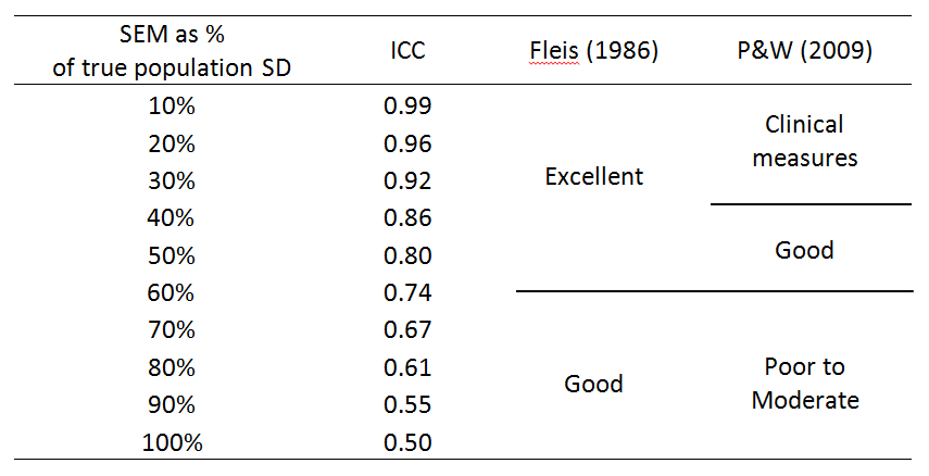
The other thing I’d point out is that none of the discussion above would have been possible on the basis of a measure of reliability such as the ICC.Fosang et al. (2003) quote the ICC for popliteal angle as 0.72. I defy anyone to construct a rational interpretation of the impact of measurement error on clinical interpretation on the basis of that number!


Bland, J. M., & Altman, D. G. (1996). Measurement error and correlation coefficients. BMJ, 313(7048), 41-42.

Fosang, A. L., Galea, M. P., McCoy, A. T., Reddihough, D. S., & Story, I. (2003). Measures of muscle and joint performance in the lower limb of children with cerebral palsy. Dev Med Child Neurol, 45(10), 664-670.

Jozwiak, M., Pietrzak, S., & Tobjasz, F. (1997). The epidemiology and clinical manifestations of hamstring muscle and plantar foot flexor shortening. Dev Med Child Neurol, 39(7), 481-483.


Making attractive gait graphs in Polygon

Not a proper post this one and only of interest to Vicon users but, prompted by one of the students on our Masters Programme in Clinical Gait Analysis,  I’ve created a video to illustrate how to create nice gait graphs within Polygon. It also shows how you can export these easily to Word and the data to Excel (then you can look at an earlier post to see how to create yet another set of graphs!) .  I’ve used Polygon 4 to create the video but I know there are still many Polygon 3 users out there. The interface looks a little different but the basic process is exactly the same. The main difference is that there is no Attributes panel in Polygon 3. In most cases you have to right click on an object (graph, graph axis etc) and select one of the options on the menu that then appears.


Analysing analysis

What do we mean by clinical gait analysis? Most of you reading this blog will assume it requires a kinematic measurement system, a couple of force plates and possibly an EMG system. For the vast majority of clinicians across the world, however, it means looking at how their patients walk without even the benefit of a video camera. In my book I suggest that what we call clinical gait analysis should really be called instrumented clinical gait analysis. I then pointed out that this is rather cumbersome and that I’d use the term clinical gait analysis anyway!

OGA Rancho

The team at Rancho Los Amigos used the term Observational Gait Analysis as long ago 1989 when they published their Handbook. The photo below is the cover of the 4th edition from 2001. The most recent edition is an app for the iPhone which you can get download from iTunes (doesn’t seem to be any Android equivalent yet unfortunately). Brigitte Toro picked up on observational gait analysis (OGA) and introduced video-based observational gait analysis (VOGA) in a review article a few years ago now (2003). If we used these terms carefully there would be clear ground between them and clinical gait analysis which could be reserved for the instrumented approach.

I was, however, interested by the comments of Professor Phil Rowe from Strathclyde University speaking at one of the satellite events orbiting ESMAC in Glasgow this year and focussing on the word analysis. His point was that analysis is a process of thinking which requires some data.  It is thus not possible to perform a clinical gait analysis without some sort of instrumentation to provide those data. On this basis it would be inappropriate to refer to clinical observation of walking (either direct or through video recordings) as analysis. Perhaps clinical or observational gait assessment  are more appropriate terms (although we then end up with the same acronym, CGA). The surgeons in Melbourne also used to talk about gait by observation which seems another sensible alternative. As an engineer I quite like Phil’s line of reasoning and think a distinction between a true analysis of data and an observation of patterns is useful.

But maybe things aren’t so clear cut. Wikipedia defines analysis as the process of breaking down a complex topic into smaller parts to gain a better understanding of it. This definition doesn’t actually require any data.  It’s also true that whenever I’ve heard observational gait assessment being taught the focus has been on breaking down the overall gait pattern into smaller parts, either by plane or level, or both, to aid understanding. Maybe I’m being over-protective in trying to restrict the term analysis to instrumented processes. Any comments?

.

Toro, B., Nester, C., & Farren, P. (2003). A review of observational gait assessment in clinical practice. Physiotherapy Theory and Practice, 19(3), 137-149.

Can U C thru the ICC?

This post is really a follow-up to the rant I had about psychometrics about a month ago. Again its prompted by preparing some material on Measurement Theory for our Masters programme. It focusses on the use of reliability indices for assessing the variability associated with measurements. Needless to say reliability indices are a central feature of the psychometric approach.

The more I think about these the more worked up I get. How can something so useless be so widely implemented? The main problem I have is that the indices is that they are almost impossible to make any sense of. Fosang et al. (2003) reported an interrater intra-class correlation coefficient (ICC) for the popliteal angle of 0.78. What on earth does this mean? According to Portney and Watkins (Portney & Watkins, 2009) this rates as “good”. How good? If I measure a popliteal angle of 55° for a particular patient how do I use the information that the ICC is 0.78? Perhaps even more important, if another assessor, measures it to be 60° a few weeks later how do we interpret that?

What is even more frustrating is that there is far superior alternative, the standard error of measurement (SEM – don’t confuse with the standard error of the mean which sounds similar but is something entirely different). This expresses the variability in the same units as the original measure. It is essentially a form of the standard deviation so we know that 68% of repeat measures are likely to fall within ± one SEM of the true value. Fosang et al. also report that the SEM for the popliteal angle is 6.8°. Now if we measure a popliteal angle of 55° for a particular patient we have a clear idea of how accurate our measurement is. We can also see that the difference of 5° in the two measurements mentioned above is less than the SEM and there is thus quite a reasonable possibility that the difference is simply a consequence of measurement variability rather than of any deterioration in the patient’s condition. (Rather depressingly we need to have a difference of nearly 3 times the SEM to have 95% confidence that the difference in two such measurements is real).

Quite often the formula for the SEM is given as

SEM=SD√(1-ICC).

This suggests that the SEM is a derivative of the ICC which is quite misleading. The SEM is quite easy to calculate directly from the data and should really be seen as the primary measure of reproducibility with the ICC the derivative measure:

ICC = 1-(SEM/SD)2

There are at least six different varieties of the ICC  representing different models for exactly how reliability is defined. Although the differences in the models appear quite subtle the ICC calculated on the basis of the different models vary considerably (see pages 592-4 of Portney & Watkins, 2009 for a good illustration of this) . It is quite common to find publications which don’t even tell you which model has been used.

Simplifying a little, the ICC is defined as the ratio of the variability arising from true differences in the measured variable between individuals in the sample (variance = σT2) and the total variability which is the sum of the true variability and measurement error (variance = σT2E2), thus

ICC=(σT2)/(σT2E2)

Unfortunately this means that the ICC doesn’t just reflect the measurement error but also the characteristics of the sample chosen. If the sample you choose has a large range of true variability then you will get a higher ICC even if the measurement error is exactly the same. This means that, even if you can work out how to interpret the ICC clinically, you can only do so sensibly with an ICC calculated from a sample that is typical of your patient population. It is nonsensical, for example, to assess ICC from measurements on a group of healthy individuals (which is common in the literature because it is generally easier) and then apply the results for a particular patient group.

Luckily there is a safeguard here in that for most measures we are interested in the true variability in a group of healthy individuals is lower than that in the patients we are interested in so the ICC calculated form the healthy individuals is likely to be a conservative estimate of the ICC for the patient group.

Interpretation of the ICC is generally based on descriptors. Fleis (1986) suggested that an ICC in the range 0.4 – 0.75 was good and over 0.75 was excellent. Portney and Watkins (2009) are a little more conservative regarding values below 0.75 as poor to moderate, above 0.75 as good. In their latest edition, however, they do suggest that “for many clinical measurements, reliability should exceed 0.90 to ensure reasonable validity [sic]”.

It is possible to do a little maths to explore these ratings. Using the formula  above we can calculate the ICC for different values of the SEM (σE, as expressed as a percentage of the standard deviation of the true variability within the sample σT).

SEM

You can see that even if the measurement error is the same size as the total variability in the sample studied then the ICC is still 0.5 so Fleis’ early suggestion that an ICC as low as 0.4 represents good reliability is a little suspicious. Using his scale reliability is still assessed as excellent starts at an ICC of 0.75 which corresponds to the measurement error still being over half (60%) the standard deviation of the true variability – doesn’t sound particularly good to me, let alone excellent! Even Portney and Watkins’ cut-off of 0.90 for clinical measurements still allows for the measurement error to be almost exactly a third of the true variability. All in all I’d suggest that either set of descriptors is extremely flattering.

So the ICC is ambiguously defined, difficult to interpret, compounds reproducibility with sample heterogeneity, and has a clearly superior alternative in the SEM. Why on earth is it so popular? I’d suggest the reason lies in the table above – if your reproducibility statistics aren’t very good then put them through the ICC calculator and you’ll feel a great deal better about them. Award yourself an ICC of just over 0.75 and feel that nice warm glow inside as you allow Fleis to label you as excellent!

PS

You might ask how we ever got in this situation and I suspect the answer may lie in the original paper of Shrout and  Fleis (1979) and the example they use to discuss the use of the ICC;

“For example Bayes (1972) desired to relate ratings of interpersonal warmth to nonverbal communication variables …”

Does it surprise us that measures developed to quantify reliability of variables such as  interpersonal warmth and nonverbal communication may not be directly applicable to clinical biomechanics? Perhaps interdisciplinary collaboration can be taken a little too far.

.

Fleis, J. (1986). Design and Analysis of Clinical Experiments. New York: John Wiley & Sons.

Fosang, A. L., Galea, M. P., McCoy, A. T., Reddihough, D. S., & Story, I. (2003). Measures of muscle and joint performance in the lower limb of children with cerebral palsy. Dev Med Child Neurol, 45(10), 664-670.

Portney, L. G., & Watkins, M. P. (2009). Foundations of clinical research: applications to practice. (3rd ed.). Upper Saddle River, NJ: Prentice-Hall.

Shrout, P. E., & Fleiss, J. L. (1979). Intra-class correlations: uses in assessing rater reliability. Psychology Bulletin, 86, 420-428.

Forming, an opinion

It’s nice to receive the first review of my book (in the Journal of Biomechanics) that I’ve been able to read easily (the only other one I’m aware of is in French and was really a little beyond what I’d learned in school over thirty years ago).

It’s interesting that Steve has picked up on the issue of the omission of sample paperwork which he feels would have been useful. My original intention had been to include a whole suite of procedures and protocols which could have been copied and pasted into service level documentation folders across the world. The first thing that prevented me was very straight forward; I had a page limit to work to from the publishers.

The other thing that made me change my mind, however, was the growing realisation that the process of writing service level documentation is actually more important than the result. Sitting down and writing such documents is an extremely useful exercise and doing it properly ensures that you have thought through the issues for yourself. I’d suggest that it’s much better for gait analysis service teams to produce such documents for themselves than to rely on what some “expert” has written for a different service operating in a different context.

Take a Referral Form for example. In some ways this is simply a piece of paper that tries to force the referring clinician to tell you what you need to know about the patient so that you can do your job properly (don’t get your hopes up – I don’t know of any gait analysis service in the world that actually gets useful information from referrers however well-structured the form).  On the other hand though, it reflects the relationship you want to have with your referrers and may include an implicit or explicit specification of the patients you feel qualified to assess. You can just pinch a copy of someone else’s form, but it is much more valuable to work through these issues for yourself and develop your own form that reflects the characteristics of your service. Thinking about what you do is at least as important as doing it.

There is a similar issue with normative reference data (see YouTube video of my presentation last year to GCMAS on the subject). The main reason for collecting normative reference data is to learn from the experience. Putting 30 able bodied volunteers through the lab, reflecting on the mean traces and variability around it and comparing this with data from other service is a learning and quality assurance exercise that all services should go through (and should repeat every so often). Pinching someone else’s data simply so you can have those nice grey bands in the background of your own graphs is missing the point entirely. It still amazes me how many services do this.

As this post’s title suggests, this is purely my personal opinion. Maybe specimen forms that could have been adapted would have been useful. Maybe I should have made these available but in .pdf format so people would at least have to do the word processing for themselves! The page limit argument is a bit ridiculous in a world of electronic supplements. What do you think? Maybe if enough  people demand them through comments here I’ll work on it for the next edition (if people buy enough copies to make Mac Keith want to publish one!)