A bit of a work out

While still reflecting on the way we use terminology so misleadingly within gait analysis it might be worth thinking a little about the concept of external work. It’s a concept that is even older than I am. Although previous workers (notably Fenn and Elftman) had used similar concepts it was Giovanni Cavagna who popularised it with his classic paper from 1963.  (Cavagna et al. 1963). The article starts with the sentence, “The work performed in walking can be considered as being made of two components, the internal work and the external work”. My response to this is that you can consider it like that if you want but you are likely to confuse people if you do!

Graphs from Cavagna's 1963 paper showing how horizontal components of speed and displacement are calculated from acceleration data. Note that his data was taken from an accelerometer worn on the body whereas it is more common these days for similar techniques to be used based on forde plate measurements.

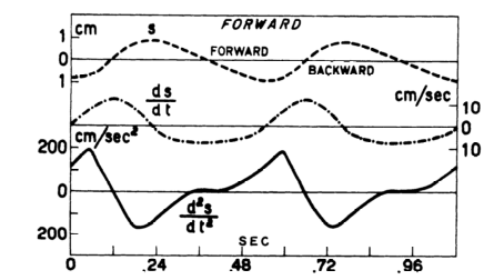
Graphs from Cavagna’s 1963 paper showing how horizontal components of speed and displacement are calculated from acceleration data. Note that his data was taken from an accelerometer worn on the body whereas it is more common these days for similar techniques to be used based on force plate measurements.

Let’s be clear that there is no external work in walking. All the work required for walking is generated internally by the muscles. The result of muscles (and ligaments) exerting forces on the skeleton is that the foot exerts a force against the floor and generates the ground reaction (following Newton’s third law) but the ground reaction itself doesn’t do any work. It can’t. In order for a force to do work the point of application needs to move and the ground doesn’t move (well, not very often).

Whether its name is correct of not, the concept is important because it allows an estimate of the energy cost of walking on the basis of force plate measurements alone (cuts out all that nasty kinematics). The theory behind the calculations is generally presented as  straightforward but actually requires some quite subtle reasoning.

Although the ground reaction doesn’t do any work, it is a force applied externally to the body and will result in the centre of mass of the body being accelerated (Newton’s first law). If we measure the ground reaction we can thus calculate this acceleration and thus how the centre of mass is moving (its velocity and displacement).

Now if we wanted to move an equivalent mass through the same trajectory we could do so by applying an external force of the same magnitude and direction as the ground reaction directly to its centre of mass. If we did this then the point of application of this imaginary force would move and it would do work. Knowing the laws of physics it is reasonably easy to calculate what this work would be.

This can be taken as equivalent to the work that the muscles have to do to move the centre of mass, but it should be emphasized that the external force applied at the centre of mass is entirely imaginary, for the purposes of the calculation only. All the work is done internally by the muscles.

Of course this is one of those areas where people who understand the underlying concepts can cope with the fact that the name is wrong and get on with life … but I suspect that the terminology has the potential to be extremely misleading for those who don’t.

Additional note. It may also be worth being explicit that the muscles do other things as well as moving the centre of mass. They also move the segments with respect to the centre of mass and the work required to do this is not captured in the calculation outlined above. The calculation will thus always be an under estimate of the true mechanical cost of walking. It’s interesting that despite the extent to which these techniques have been used there have been very few studies of how much of an under-estimate, either for normal walking or for walking with pathology of different kinds.

How long is a piece of string?

Lurking somewhere on this blog-site is software that Vicon users can download to calculate “muscle lengths”. It’s based on calculating the distance between the origin of a muscle on one segment and its insertion on another as illustrated in the diagram below (taken from my book). Some of the muscles (such as the rectus femoris) can be best represented as a straight line between the origin and insertion, whereas others (such as psoas or iliacus) have to pass around bones and may be better represented by including a “via point” along the path and adding the lengths of the two lines thus created.

muscle lengths

Clearly as the joint or joints linking the relevant segments move this distance changes and you can thus plot muscle length on gait graphs in the same way that you can plot any other gait data. The technique has been around for a very long time but has been particularly popular since Scott Delp’s work on SIMM in the late 1980s.

Recently Jussi has added a comment to the page first saying that he’s got the software working (good) but then that a “somebody” has suggested “that ‘point-to-point’ muscle length models tend to be inaccurate, and a joint angle/moment arm based methods would be more accurate”.

This is quite an interesting comment because I don’t really consider this technique as “accurate”. The technique is based on a rather crude scaling of one set of origin and insertion coordinates. We don’t really know how consistent these are across healthy individuals and certainly not  how they are affected in people with the sorts of conditions that we generally assess in clinical gait analysis (particularly those with bone, joint or muscle deformity). Further the calculations are dependent on the assumptions you make about how the joints move and ultimately on the accuracy of the joint angle measurements. All in all this is probably best described as a technique to “estimate” muscle length rather than to “calculate” it.

My general advice for clinical interpretation is that if you are dealing with single joint muscles then the muscle length graphs don’t really tell you much that you can’t already see on the joint angle graphs. Generally as a the joint extends the extensors get shorter and the flexors get longer (and vice versa) and the muscle length graph looks extremely similar to the corresponding joint angle graph (but with different units). Given that the actual calculations of muscle length are subject to so many assumptions you might as well work directly from the joint angle graphs.

The multi-joint muscles are different though because the muscle length depends on the orientation of both joints and the separate moment arms of the muscle about each. It is thus virtually impossible to assess how the muscle length varies through the gait cycle. In this case muscle length graphs are the only sensible way of getting an insight into how a muscle is behaving and can be valuable despite knowing that the actual values are only estimates. At least they are consistent estimates so that there is some sense in comparing the data you estimate for a patient against normative data which you have estimated using the same modelling procedure.

The most obvious example of this is in considering hamstrings length in children with cerebral palsy. It is extremely tempting to see a bent knee and assume that the hamstrings must be short. The “obvious” surgical response is to lengthen them. In many kids, however, the hip is also flexed and, because the moment arm at the hip is greater than that at the knee the muscles is often actually considerably longer than “normal“. This would suggest that surgical lengthening is inappropriate. Scott Delp and Alison Arnold drew the attention clinical community to this nearly twenty years ago and if there is one good reason for including muscle length estimates in gait reports for kids with CP then this is it. The data doesn’t have to be that accurate to be a reminder to surgeons that this is an important issue.

In direct response to Jussi’s question I don’t think its possible to say whether “point-to-point” or moment arm based calculations are more accurate. The calculations are affected by different factors and its not at all clear whether either is superior in general. The accuracy of whichever technique you use will be dependent on the quality of the input data (point coordinates or moment arms). As pointed out above accuracy is limited by a number of other factors and some of these may be more important than the choice of technique. Perhaps most importantly I’m not aware of any research that has ever been done to assess the accuracy of any muscle length calculations (though there is at least one that investigates the  difference in results from a using a number of techniques ).

Of course this assumes that muscle lengths are being used clinically to understand why a patient walks the way they do. Anyone wanting to use them for more technical purposes perhaps in the generation of more advanced muscuol-skeletal models really needs to develop an in depth appreciation of all these factors for themselves.

.

PS Just to avoid the terminology police its worth reminding people that what almost everyone refers to as “muscle length” is actually the musculotendinous unit length. Maybe this is something that should have been added to my rant on terminology last week.

Mind your language

I’ve recently heard of a new history of gait analysis being written and been given a preview of the section on language development which I’ve been given permission to share.

The first task was obviously to understand how people walked. This proved more difficult than anyone imagined and at the end of the process everyone was considerably more confused than they were at the start. To cover this up they invented a new range of words and phrases.

Someone identified six determinants of gait which everyone agreed was a good thing despite very few of them really determining gait and the one that actually did being completely over-looked. The fourth and fifth were so vague as to be virtually useless but this was cunningly disguised by describing them both in the same paragraph which then looked nearly as long as the paragraphs describing the others.

The gait cycle was divided up in such a bizarre and counter-intuitive way that everyone thought it was a joke until they found it had been published in a text book and had to start using it. Mid-stance wasn’t in the middle of stance and terminal stance wasn’t at the end. There was a pre-swing but no pre-stance (which is actually more important). Single support was divided into two phases while swing was divided into three despite being the same period of time (but for the other leg). This made it virtually impossible to talk about what one leg was doing while the other leg was doing something else. At least this made things simpler. Shock-absorption started to be used for the phase when the upward movement of the body was being speeded up and push-off of for that when its downward movement was being slowed. Heel strike was adopted for the instant (or was it a phase?) when the foot contacted the ground despite many people not using their heel and very few of them striking the ground to any appreciable extent.

The plantar flexion knee extension couple was introduced despite the fact it clearly wasn’t a couple and three rockers invented despite no-one really knowing what a rocker was. The Americans assumed it was a quaint Anglo-Saxon term whilst the English assumed it was some new-fangled American word. Speakers of English as a second language just assumed they had slept through that lesson. When it was finally established that rocker didn’t have a specific meaning a fourth was added in celebration.

There was a backlash against terms that oversimplified complex concepts and very soon a demand emerged to balance this with other terms that would overcomplicate simple ones. A double bump in the ankle plantarflexion moment thus became a widely accepted alternative to “toe walking”. One group even went as far as to suggest that treatments that resulted in toe walkers achieving a heel contact be described as having effected a biomechanical transformation.

A challenge to the hegemony emerged from a perky Canadian who asserted that it was possible to understand walking by plotting joint moments. This was immediately recognised as a threat by the establishment. If walking could be understood then there might be an obligation on them to understand it. This might compel them to learn biomechanics which was clearly a bad thing. The solution was elegantly simple. They introduced some doubt as to whether internal or external moments should be plotted. (A radical splinter group even extending this to plotting some of the graphs upside down). This essentially made it impossible to categorically distinguish between the action of an agonist and its antagonist in normal conversation and successfully curtailed any useful contribution from the new approach. The status quo was re-established and the establishment was heard to exhale a collective sigh of relief.

Everyone understood what normal walking was but then some kind person realised that this forced them to talk about their patients as being abnormal which didn’t sound very nice. There was a competition to find an alternative which several people entered but nobody won. People still seemed happy to refer to these people as subjects. This sounded even less nice to some people but after the experience with normal they were largely ignored. A small group pointed out that referring to diplegic patients “put the disability before the patient” and went around scribbling out the term whenever they saw it and replacing it with patients with diplegia. At least this kept these people occupied and prevented them doing anything more damaging. In some fields the equivalent phrases were so unwieldy that they were replaced with abbreviations such as PwPD or PwMS. The end result of this process was thus to reduce groups of people who had previously had the dignity of being described by words to the ignominy of only ever being referred to by abbreviations.

The crowning glory was in achieving universal agreement that crouch gait was the biggest enemy but universal disagreement on what the term meant. Eventually it was decided to let everyone write their own definition – problem solved.

I gather this work is still in progress and if any readers would like to contribute additional examples of linguistic development in gait analysis as comments to this post then these will all be considered for inclusion in the definitive version.

Walking faster makes you live longer

A study that has just been published in The Lancet proposes a short questionnaire (11 questions for men , a different 9 questions for women) to assess your risk of dying within the next five years. If you want to complete the questionnaire and calculate your “Ubble age” you can just click here. One of the questions is:

How would you describe your usual walking speed?

  • Slow pace
  • Steady average pace
  • Brisk pace
  • None of the above

With the clear implication that your walking speed affects your risk of dying. What a godsend for our field. If merely asking people to categorise their walking speed on this four point ordinal scale works then imagine how much more accurate that prediction would be if we actually measured it? I can imagine gait analysis services all over the world opening up their doors to supplement their incomes by calculating people’s death risk on the basis of walking speed. More seriously I wonder how long it will be before we see this article being cited as part of the evidence base for proposals to support further research into the link between walking speed and longevity. It’s published in a very highly rated journal.

But let’s unpick the study a little bit. It is based on data from the UK Biobank project. Half a million participants thought to be representative of the UK population were enrolled and 655 measures of demographics, health and lifestyle were recorded. These individuals have then been tracked for five years to see which ones died. On this basis the 655 measures were ranked by how strongly they predicted death. Some of these are obviously very highly associated (there are for example several different ways of measuring smoking) so  the authors have selected a range of the strongest unrelated predictors of death on which to base their questions. So far so good – there is a robust scientific methodology which selects walking speed as one of the strongest predictors of death.

But one of the wonderful aspects of this study is that the data has been presented in a format that allows you to probe the data on which the study is actually based.  It is based on the hazard ratio which is the risk of dying for each answer divided by the “reference” answer (in this case walking at “steady average pace”)

The table looks like this:

Category Hazard ratio [95% CI] Deaths P-value
Steady average pace 1.0 (reference) 2653 Reference
None of the above 2.7 [1.9-3.8] 33 1.5 x 10⁻⁸
Slow pace 2.8 [2.6-3.0] 1275 3.3 x 10-198
Brisk pace 0.7 [0.6-0.7] 1165 1.8 x 10⁻²⁸
Unable to walk 4.6 [3.7-5.6] 98 2.9 x 10-49

Note that brisk walking reduces risk of dying to 70% of the reference value but that slow walking increases it to 280%. Slow walking is thus a much stronger sign that you are more likely to die than brisk walking is that you are less likely to die. This is confirmed to a certain extent by the p-values. With such a large study getting high p-values is almost inevitable so I’d ignore the absolute values, but the relative values show that that the association with slow walking is much stronger than that with brisk walking.

And why do people walk slowly? Well most people who walk slowly will do so because they have a health condition that prevents them from walking at a “steady average pace”. It shouldn’t really surprise us that people with pre-existing medical conditions are more likely to die than those without. This is confirmed by the final row of the table above which shows that the risk shoots up even higher for people who are unable to walk at all (indicative of a much more serious health condition).

To my mind the most sensible interpretation of this observation is that walking speed is important as an indirect indicator of a pre-existing medical condition rather than a parameter of strong predictive value in its own right. This is backed up by the observation that the strongest single predictor or death is the extremely simple question – “In general how would you rate your overall health?”. People who consider themselves healthy are less likely to die than those who don’t!

This is further confirmed by restricting the analysis to “all cause mortality in healthy individuals” in which case the prediction value of walking speed falls off dramatically and lines up with a range of other fairly weak predictors. (If you do this yourself don’t be fooled by the change of scaling on the vertical axis which hides this to some extent). In other words if you restrict the analysis to people who don’t have a pre-existing medical condition then walking speed is a much weaker predictor of death.

So my suggestion is that we don’t all rush out and set up death predicting services to augment our income – or if we do that we do it extremely cynically and exhort as much money as possible from the people that are gullible enough to pay it.

Spoonful of sugar: a re-think

One of my earliest posts was about how efficient walking is and how little energy it takes to walk around. I illustrated this by the observation that it takes only the energy contained in two heaped teaspoons of sugar to allow an average adult to walk for a kilometre at a comfortable pace. After mentioning this as part of a tutorial I gave last month at the Gait and Clinical Movement Analysis in Portland several of us sat on chatting about whether this is a small amount of energy or not.

There is a problem in trying to think about how efficient walking is in that efficiency is generally defined as the energy output by a system divided by the energy that is input to a system.  The problem in relation to walking over level surfaces is that it doesn’t necessarily take any energy to move an object from one point to another if it is at the same height and moving at the same speed at the end of the movement as it was at the start. Think of a perfect wheel,  once we use a relatively small amount of energy to get it rolling, it will continue to roll along a level surface without requiring any energy input. If the energy output by the system is zero then it makes the calculation of efficiency a rather pointless exercise. Nothing divided by two teaspoons of sugar is nothing but so is nothing divided by one teaspoon of sugar or nothing divided by a hundred teaspoons. How can we get a handle on whether two teaspoons is a lot of energy or not?

One way might be to calculate the gradient of a slope we would have to be walking down in order for the loss in height to be provide the energy for walking rather than our bodies burning up food. Ralston’s classic paper of 1958 calculated the nutritional energy cost of walking (the amount of food energy that needs to be consumed) to be about 3.3 Joules/kg/m (assuming 1 cal = 4.186J) and more recent work that I’ve published agrees.  If that energy all came from a loss of potential energy  (mass x height x acceleration due to gravity) then it is quite easy to calculate that this would require a loss of 0.33m for every metre walked (=3.3/9.81). The gradient we would have to walk down would be 1 in 3 which sounds very steep to me.

Gradient 2

A slope with a gradient of 1 in 3

But things are not quite as simple as this. The efficiency with which food energy is converted to mechanical energy is estimated to be about 20% so the mechanical work that 3.3 J/kg/m represents is about 20% of the nutritional energy cost. This energy is thus only really equivalent to walking down an 1 in 15 gradient. It is also important to remember that about half of the gross energy cost of walking comes from the basal metabolism that is required to keep your body functioning regardless of whether you are walking or not. On this basis the effective gradient should perhaps be reduced even further to 1 in 30.

slope

A slope with gradient 1 in 30.

So does this help? Well the 1 in 3 slope that we arrived at when just thinking about the nutritional cost is quite steep and perhaps serves as a reminder that the energy density of foods such as sugar is very high. We shouldn’t assume that just because we’ve got a a small amount of sugar that we have a small amount of energy. On balance, however, I think the 1 in 30 slope that arises when we take account of the basal metabolism and the efficiency of conversion of food to mechanical energy is a fairer reflection of how efficient walking is. This slope looks quite gentle and I think the overall conclusion that the walking is reasonably efficient is justified. The gradient isn’t however so small that it can just be ignored. The mechanical cost of walking appears to be the equivalent of raising the body mass by about 4cm more than is necessary for every stride (assuming a stride is about 1.3m long).