Demonstrating the gravity of the situation

I’ve been modifying e-Verne recently to make him a little more friendly to use on tablets and phones, particularly those running under iOS or Android (follow this link for tips). This has been in preparation for a Tutorial session I’m presenting at the GCMAS meeting next week in Portland. While I was doing the maintenance something reminded me of a picture in Braune and Fischer’s, “The Human Gait” (which was originally released in chapter form between 1895 and 1904) of a device to calculate the position of the centre of gravity of the whole body once you know the positions of the centre of gravity of the individual body segments. I scanned through through the book and this is the image that I remembered from page 127. The ingenious scaffolding mechanism moves the black spot in the centre to illustrate where the centre of gravity is.

Gravity man

I thought it might be interesting to add this functionality into Verne and below you can see how it looks. Use the “Mass centres” button to toggle the centre of mass positions on and off. The individual segment masses are depicted in black. The red and blue symbols are the centre of masses for the different limbs (femur, tibia and foot segments combined) and the green one that of the overall body. The area of the symbols are proportional to the mass of the different segments with the masses and centre of mass positions for the individual segments based on the data in David Winter’s book. Drag on the different segments to move them around (there are more instructions on the Verne page of this blog-site.

Whilst checking to see if I could save myself the walk to the scanner by surfing to  find if the image from The Human Gait was already on-line I was fascinated to come across a similar picture.

It’s from the catalogue of the German scientific instrument maker Eduard Zimmermann published in 1904. It’s labelled as a “Schwerpunktmechanismus nach Fischer”. They obviously sold well because they are still listed in the 1928 catalogue where a fuller description is available. It doesn’t say how big this was but it weighed 4.6 kg so much have been a fair size.


Walking with pathology

One of our students studying for the MSc in Clinical Gait Analysis recently wrote an essay of “The role of gait analysis in  spina bifida” (myelomeningocele) which reminded me about work we did about 15 years ago when I was in Belfast (unfortunately it only ever got written up in Michael Eames’ MD thesis). At the time we were doing some modelling to look at how people with this condition walk. This young man has got a lesion at lower lumbar level (L4/L5) which means he’s got marked weakness in a range of lower limb muscles including plantarflexors, hip extensors and hip abductors. (He’s walking with the help of solid AFOs although you don’t see these on the “skeleton”). Importantly he retains function in his quadriceps (which are innervated from above this level).

This is a classic gait pattern for a person with this condition. It shows the trunk moving considerably from side to side. It looks clumsy and uncontrolled and its extremely tempting to make straightening him up an aim of therapy.

But the data were collected as part of a study into how the centre of mass moves. If you look carefully you’ll see there appears to be a blue ball moving around within the pelvis. This is the centre of mass, the point at which all the body’s weight can be assumed to act. It appears to be moving a lot from side to side confirming how much the trunk is moving around. If you hover your mouse pointer over it, however, you’ll find this is an optical illusion. The ball itself is moving very little from side to side, it only appears to be moving because of the larger movements of the trunk and especially the pelvis which your eye tends to follow. When we calculated the excursion from side to side it was very little more than the excursion that you or I use when walking around.

So what we might be seeing is not clumsy and uncontrolled gait but an exquisitely controlled gait that keeps his centre of mass pretty much in the same place whilst there is all that trunk movement going on around it. This is particularly amazing given that he has no functioning in his abductor muscles which are those that are primarily responsible for medio-lateral control. What we found is that his trunk moves so far that, at the end of the range of movement when control is required, the adductor muscles, which are preserved at this level, are able to provide this control. An alternative way of looking at this gait pattern is as the central nervous system is doing an amazing job in optimising the way he walks taking into account his neuromuscular deficits. If you try and train him to walk more upright the chances are he’ll walk a lot less efficiently and perhaps less functionally. I’m not even sure he could walk at all without the trunk sway (and without walking aids). If you want the optimum gait pattern given his impairments maybe you should leave the gait training to the central nervous system!

It’s for this reason that I prefer to talk about walking with pathology rather than pathological walking. I suspect that most of our patients are walking as optimally as they can given their impairments (which might included impairments to the central nervous system). Their walking is anything but pathological.

Of course the gait pattern may place abnormal stresses on various structures which may cause degenerative changes. This needs to be factored into any management plan but it should also be remembered that people with gait patterns like this quite often do not walk very much and the potential detrimental effects of high loading during walking may be offset to some extent by its limited duration.

More on muscle

In his comment to my last post BJ said, “I think our field needs some general physiological principles (such as “muscles generate very little passive force during walking”) to help improve the accuracy of our muscle force estimation process”. In his book Rick Lieber states, ” It is difficult to hypothesise, a priori, the ‘best’ sarcomere length operating range of muscle”. So there’s a challenge!

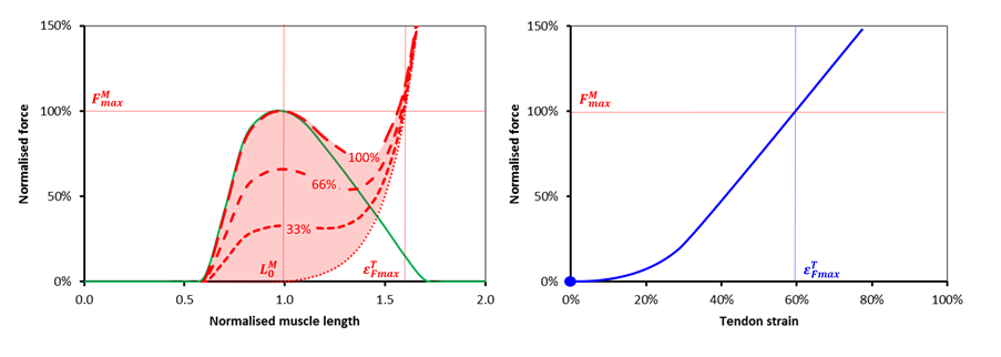
In looking at the issues I realise that I’ve never really seen a simple analysis of how a muscle and tendon work together in series (most I’ve looked at get very complicated very quickly, e.g Winters as quoted by Thelen). So let’s take the well known properties of the force length curves for muscle and tendon (see Figures below) and try and consider how they would lead a simple musculotendinous unit to behave.

Muscle and tendon

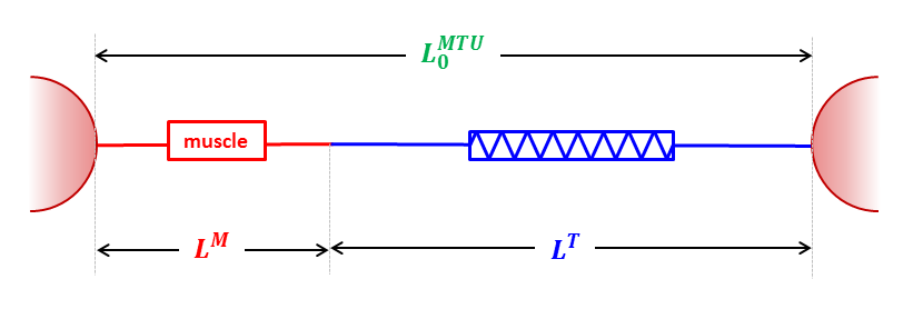
Let’s assume the simplest possible arrangement of these as two elements in series held at fixed length. Let’s start off by analysing what happens when this fixed length is what I call musculotendinous unit slack length. This is the minimum separation of origin and insertion at which both the inactive muscle and tendon generate no tension (muscle at optimal length, tendon at tendon slack length to use the jargon).

MTU

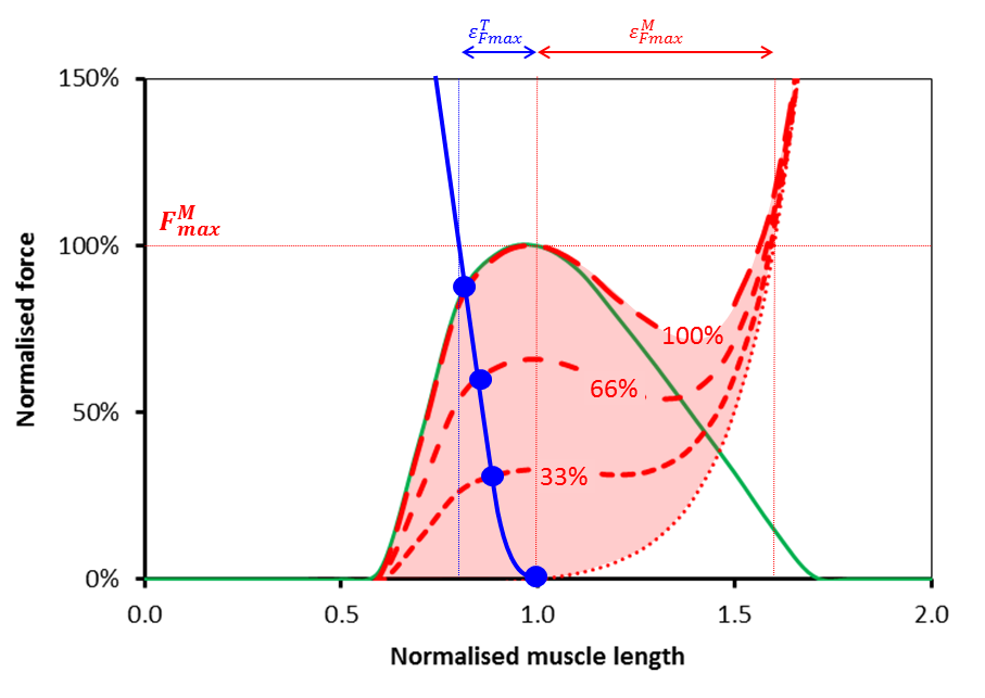
Its obvious that together the length of the muscle and tendon must equal the fixed length we’ve chosen so it becomes possible to plot the force generated in the tendon as a function of muscle length on the same graph as that for the muscle (see Figure below). It looks steeper because the horizontal scales of the two graphs above are different and it appears to be the wrong way round because as the muscle get’s longer the tendon will get shorter.

MTU graph

Now if any two mechanical elements are in series like this we know that the same force must pass through both (these are the laws of physics and we can’t do anything about them). We can thus say that the force generated by the musculotendinous unit as a whole must be equal to that at the point at which the red line and the blue lines cross for a given level of activation (represented by the blue dots for 0, 33%, 66% and full activation). You’ll see that as the muscle get’s more activated this point moves up and to the left. The tension in the musculotendinous unit increases as the muscle shortens (and hence the tendon lengthens) which is what you would expect.

Notice however that the force must lie somewhere on the blue curve. This restricts quite severely the range of muscle lengths at which the musculotendinous can generate force. Rather counter-intuitively (at least to my simple mind) the operating length of the muscle as a component of the musculotendious unit appears to be more dependent on the force-length characteristics of the tendon than those of the muscle. Notice also that the maximum force that the unit can generate (the point at which the blue line and maximum activation curve for the muscle intersect) is less than that for the muscle acting in isolation.

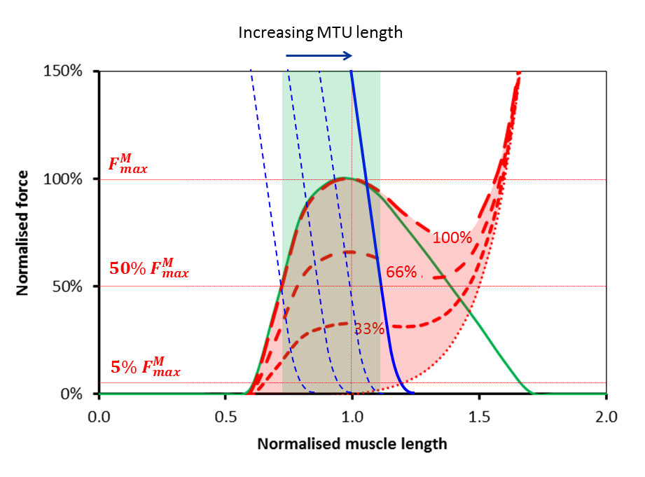
At musculotendinous unit lengths the only change in the graph is that the blue line will move to the right (if the unit gets longer) or to the left (if the unit gets shorter). An interesting observation here is that if the blue curve moves too far to the right then there will come a point at which there is a minimum force that the unit can generate as well as a maximum. This makes sense in that if you stretch the musculotendinous unit too far you will be stretching the passive parallel component in the muscle regardless of whether it is activated or not.

But let’s take that in combination with the observation I focussed on in last week’s post that when we move the joints passively (through much more than the  range of movement required for walking) during a physical examination of a healthy adult we encounter minimal resistance. This suggests that there must be a limit to how far to the right that blue line can be during walking. If we assume the resistance to passive stretch over the range of movement required for walking is less than 5% of the maximum force that the muscle can generate isometrically (I think this is quite a reasonable constraint to impose) then the most right-ward position of the solid blue line is that illustrated in the figure below. You can see that this restricts the operating range of the muscle even more than the logic I applied last week. Last week I argued that the muscle cannot be operating on the passive arm of the the force-length curve.  This week I’m suggesting that it cannot be operating on much of the descending arm either.

MTU graph (max)

The thinner dashed curves show the behaviour of the system when the musculotendinous unit is shorter. As well as a line at 5% of maximum muscle force I’ve drawn another in at 50%.  The green region is thus intended to show the range of muscle lengths over which the musculotendinous unit is capable of generating this level of force. It suggests that in order for effective force generation by the musculotendinous unit the muscle lengths must lie between about 70% and 110% of optimum length.

The curves, particularly that for tendon, will vary from muscle to muscle (and maybe from individual to individual). The data illustrated here are those use to describe the lateral gastrocnemius in the Gait2392 model which is available through the OpenSim web-site (although I’ve tweaked the characteristics of active muscle force generation to match the widely accepted work of Gordon et al.). I’ve tried it with a semimembranosus as well and get a slightly steeper tendon curve (when scaled to optimum muscle length) but broadly the same conclusions. The analysis assumes isometric contractions of the muscle but given that most of the conclusions are dependent on the characteristics of the force-length curve for tendon rather than that for muscle I can’t see how consideration of the force-velocity characteristics of muscle can make that much difference.

I’d be particularly interested to know if anyone has seen a similar analysis in print anywhere. Have I just been looking in the wrong places?


Passive resistance

I’ve recently been looking at how muscles work in a little more detail than  I have for some time. In particular I’ve been looking at the so called Hill type models which place the contractile unit in series or parallel with various elastic or viscous elements. I say “so called” because when I look at Hill’s classic paper   the model is implicit rather than explicit. This probably explains why such a wide family of models are all described as Hill type models (note that a significant number of recent papers refer to the wrong classic paper which doesn’t help).

The model I’m familiar with has the contractile element in parallel with one elastic element (the parallel elastic element or PE) and both in series with the serial elastic element (SE) as summarised by the figure below.

The serial element is principally comprised of any tendon through which the muscle is attached to a bone. The parallel element is less well understood. For a long time it was assumed that this was primarily extracellular but we now know that titin also contributes within the sarcomere. Whilst in this narrative Hill was somewhat ambiguous about how the PE and SE were aligned he did publish the now famous graph of the length tension relationship for muscle (below) which clearly shows the additive nature of the contractile and parallel elastic elements which can only be a consequence of the two being in parallel.

Hill graph

Graph from Hill’s original paper

What has interested me from my recent reading has been that if you look at different sources you get quite different estimates of the amount of overlap between the passive and active components. If we assume that the location of the active curve is in the right place then the green curve is displayed shifted either to the left or right. The graphs below are all taken from different web-sites. The overlap between active and passive curves gets less as you go from left to right. So which is correct?

Hill graphs


I’ve reduced the size of these but if you were to look at the bigger versions you’d see that most look as if they have been hand sketched and don’t give a great deal of confidence that they are based on any real data. It’s not actually clear from Hill’s paper whether his passive curve is to illustrate the concept or is a represents real data (these data aren’t presented anywhere else within the paper which is principally on the mechanics of active contraction). Lieber (p51), however, presents data  (from Wang et al. 1993) suggesting that Hill’s passive curve may not be too far out. (Of course it may be, particularly if part of the passive curve is attributable to extracellular serial components, that the overlap varies from muscle to muscle or across species).

But does it matter for healthy walking? When anyone performs a physical examination of a healthy person they can generally move the joints through a significantly greater range of motion than is required for normal walking with minimal resistance. When I say minimal resistance we need to remember that the forces exerted by the major muscles during walking can be several multiples of bodyweight  (Hoy et al., 1990). This is strong evidence that the passive elastic element never comes into play during walking. We could probably get away with a simpler model that doesn’t include it at all (that just has a muscle in series with a tendon).

If we look at Hill’s graph again this makes sense as the passive load doesn’t exceed the maximum active load until the fibre is about a third longer than its resting length and there won’t be very many muscles in which the muscle extends by more than this during walking (although care is needed in pennate muscles where the change in muscle belly length may underestimate the change in fibre length). This is largely confirmed by recent data from the Stanford group (Arnold et al. 2013) which  estimates that the rectus femoris is the only muscle in which fibre lengths exceed this length during walking.

Of course this is only true for healthy walking. One of the reasons for conducting a physical examination of our patients is because we know that many of them do have passive contractures of the muscles which limit joint movement significantly. This suggests that the overlap between the active and passive curve in their muscles may be significantly different to that in the rest of us. I’m not aware of any experimental work however to have tested this (anyone know of any?).

Generating patterns

I’ve only fairly recently come across the videos of the results of the OpenSim dynamic walker competition on the OpenSim YouTube channel. The OpenSim team made the basic models available and challenged people to see how far they could make the models walk. Although you are too late to participate in the competition all the material is still available on their web-site to allow you to prepare a late entry. There are really two challenges, one is to design the model and the other is to work out exactly how to “push” it to get it started. The three best results are linked to in the video below.

Dynamic walkers are simple mechanical structures with a small number of links which, when pushed in a particular way to get started, will walk down a slope (they have to walk down a slope because they lose some energy whenever the foot collides with the ground). They were pioneered by Tod McGeer over twenty years ago and this video shows him explaining the principles. The field has grown quite markedly since and there is an annual Dynamic Walking conference (the last was in Zurich).

It seems obvious that we can learn  about the mechanics of walking using these models (although it is also important not to over emphasize the similarities – all passive walkers used a locked knee during stance, for example, whereas most of us walk in a little knee flexion which is not inherently stable and requires muscle activity). It stuck me looking at these videos that walkers may also be able to tell us something about neurology – principally because they don’t have any. These walkers are simple assemblies of passive mechanical components and without any control mechanisms at all.

What interests me is that a lot of people in the field of motor control seem to assume that if a complex cyclic pattern is observed then there must be something in the central nervous system generating it. Perhaps the most commonly cited example is the decerebrate cat. If you are careful, you can take the brain (cerebrum) out of a cat, place it on a treadmill and it will walk, and may trot and gallop as the speed increases (you can see a short video here – but you don’t have to if you object to this sort of animal experimentation). This is not the only evidence that is cited in support of the assumption that walking is driven by central pattern generators in the spinal cord (see the first two sections of this this paper for example) but it is the most graphic.

The passive dynamic walkers, however, do not have any control system for generating patterned movement and still exhibit complex cyclic patterns of movement.  It seems clear to me that whilst the basic gait pattern might be a consequence of pattern generating neurons somewhere in the central nervous system it doesn’t necessarily have to be. I’m not an expert in the field but I’d guess that the most likely explanation is that there is an interaction between the basic mechanical behaviour of the system and the neural control which is rarely discussed. This is supported by recent work from Gottschall and Nichols which shows that, however the decerebrate cat is generating cyclic movement, the walking pattern is influenced by head position, indicating that it is modulated by either vestibular or proprioceptive input.  As Art Kuo pointed out some years ago control systems incorporating proprioceptive feedback are likely to be more stable than those driven purely by pattern generators (feed-forward control).