Here’s something I’ve meant to share for some time.
Below are two graphs that I prepared for some teaching I was doing in Melbourne last August. I downloaded the data that Mike Schwartz has been so kind as to make available from his study looking at the changes in gait pattern of children when they walk at different speeds (Schwartz et al., 2008). I then formatted the sagittal plane graphs as we normally do (except that I’ve started plotting the two standard deviation range in a different shade of grey to the one standard deviation range to remind us that we often under-estimate the spread of our reference data). Data is time normalised to the gait cycle and plotted on graphs of fixed aspect ratio (3:4 in this case). All looks quite unremarkable with fairly modest changes in kinematics with walking speed.
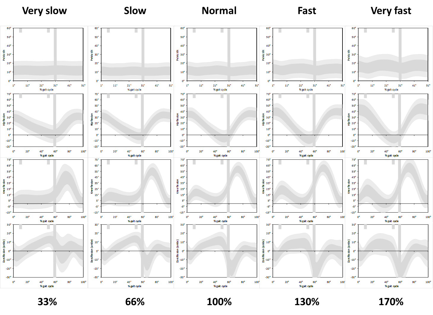
But then I realised that the slower walkers have a longer cycle time and the data should really be stretched to make comparisons as to how children are waking in real time. Slow walkers take a lot longer to complete a gait cycle than fast walkers and the data should really be plotted on wider graphs to allow comparison of what is happening over the same time period.
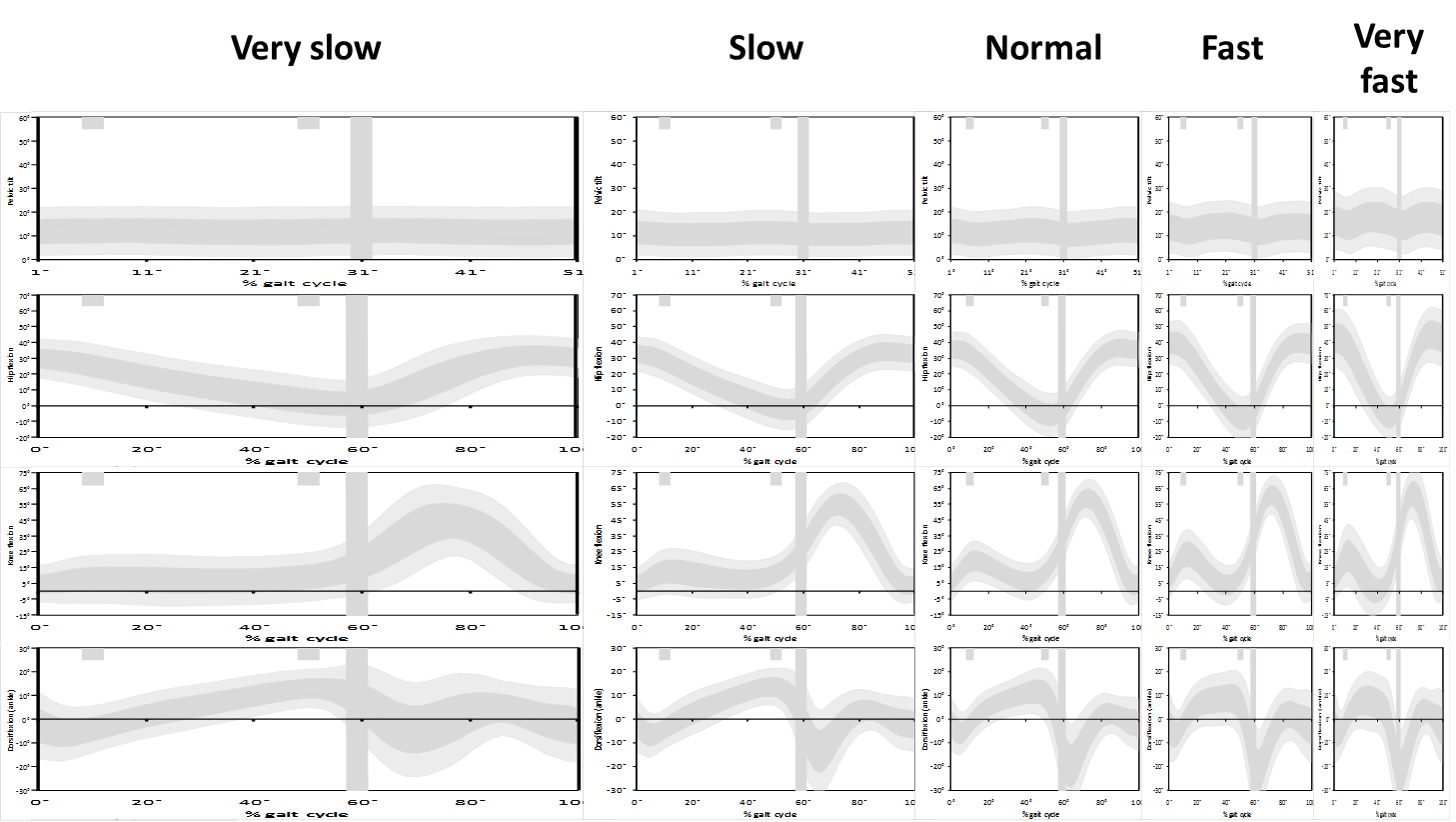
If we plot the data like this we see just how different the data really are. I’ve not absorbed the full effect or implications of this but think about the slope of the knee flexion curve in second double support and toe off which many clinicians associate with rectus femoris (mal)function. If the rectus is inhibiting knee flexion then they expect the slope to be reduced. But look at the difference between the real gradient in the lower graphs and the apparent gradient in the conventional (upper graphs). How can we possibly interpret this phenomenon from the conventional graphs?
It ‘s not clear what we can do about this. Plotting the graphs the way we do allows comparison of like with like (even if we might lose something by forcing the comparison). We often use graphs to compare outcome after intervention. How would we do this sensibly if the graphs are different shapes?
Anyone got any ideas how we can properly represent the slope data without losing the power of the straight forward comparisons we get from sticking to the tried and tested conventions for plotting data?
.
Schwartz, M. H., Rozumalski, A., & Trost, J. P. (2008). The effect of walking speed on the gait of typically developing children. J Biomech, 41(8), 1639-1650.